Monday, April 26, 2010

WP3: Final Draft

Author's Note:

Abstract art can have many different arguments that it is communicating. This is as true with any sculpture as with Fragment X-O. This simplicity of this sculpture was intriguing for me as I was choosing my sculpture, but this simplicity is also what made deciphering its true argument very difficult. There were many global and local changes that occurred between each draft of my essay because I had to figure out what the argument of my sculpture was and specifically how it formed this argument. The thesis, not only developed from draft to draft but from my statement of purpose to my final draft.

The peer review allowed me to get my thoughts in order and work out the kinks in the essay to see what was working and what wasn’t. After identifying all of the issues that needed to be ironed out, I also had to figure out what went wrong and how to make it work. My peer reviewer, Ian, gave me many great ideas on how to fix the global issues. As identified by Ian, I needed to “focus on formulating a specific argument.” So, after looking at what I already had as my argument for Fragment X-O I discovered that it was “vague” and did not come across as I wanted it to. So, after working through what I wanted to say in my thesis statement, I made the argument more specific. After this initial revision, I went through every paragraph to fully explain how each rhetorical technique, from the logos of the title to the pathos of the coloration and lighting, worked to form the sculpture’s argument. At this juncture I also sifted through my ideas to pick out the parts that were working the best for me. One example of this was that I deleted the entire paragraph that spoke about the en-dash of the title and incorporated this information into the paragraph speaking about the “X”.

The next part of the revision I completed was another global revision that altered the form of my essay. Ian pointed out that “if the title of the piece is one of the ‘most important’ parts of the sculpture, shouldn’t it be addressed first?” This piece of advice made a lot of sense to me. In the first draft of my essay, I was not as worried about the structure of the essay as I was about getting all of my ideas out and onto paper–so this was an important part of the essay to address in the revision. The first change I made was to move the section of my paper pertaining to how the sculpture and the title worked together to form the argument up to the beginning of the paper, following the introduction. After bring this portion up, I also decided to move the two paragraphs relating to “arrangement of elements” up to follow the part working with the title so that both portions related to logos were grouped together.

Locally, I also made many revisions pertaining to word choice to help reduce the confusion and vagueness that had occurred in the first draft. One of the words that Ian did not understand pertained to my argument. Initially, I was working through the idea of a “counterargument” for the sculpture. After changing the thesis, I eliminated this confusion. Ian also said that he was confused about how I was referring to my sculpture. I was alternating between using “Fragment X-O” and “Fragment” and this shortening was confusing. So, I made each of the “Fragment”s into the full title to identify what I was talking about specifically.

I made many changes between the first and the second drafts of my essay. I worked to the strength’s identified by my peer reviewer and tried to heed his advice to make revisions that I knew I needed to make. Just being more specific in what I wanted to say and having a better understanding of what I thought the argument of Fragment X-O was allowed me to improve my essay. I hope that by making these large-scale revisions I have improved my essay and will now have a better understanding of what other abstract art forms are working to communicate.


Statement of Purpose

Draft 1


Final Draft:

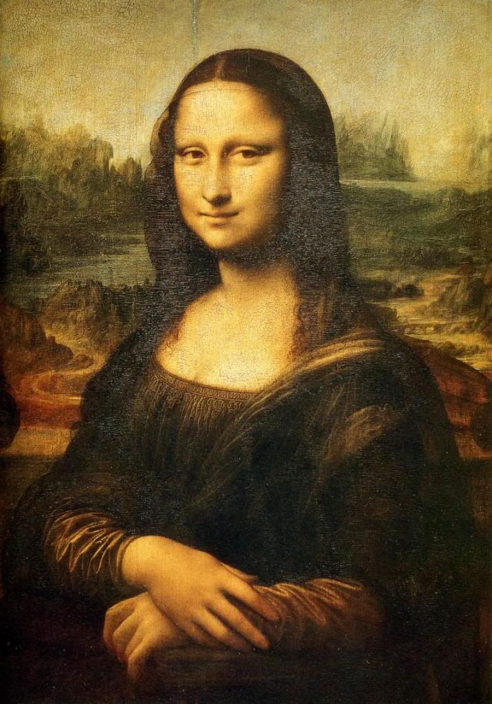
The creation of art is as old as time. As long as humans have been around, art has been created, from hieroglyphs carved on cave walls by the ancients to the portrait of Mona Lisa painted by Leonardo DaVinci. In every case, art was created with a purpose to portray a specific person, idea, or abstract representation or to appeal to the viewer’s emotions in a specific way. Some of the most interactive art are sculptures that are presented in a way in which the audience can explore and connect with the piece. One of the best environments for contact with sculptures is in a sculpture garden outdoors, where the art is readily available and it can interact with its surroundings as well as the people walking through. One such environment is the sculpture garden associated with the Sheldon Art gallery.

One of the most intriguing pieces of art in the Sheldon garden is Fragment X-O by Juan Hamilton. Juan Hamilton is an artist that began his career by working with clay and creating pottery. (University of Texas at Austin) He eventually moved into working with the bronze, exemplified by Fragment X-O, after he went to study under Georgia O’Keefe during her final years. (University of Texas at Austin) His art was greatly influenced by the sensual and fluid shapes that appeared in her paintings. Fragment X-0 was also highly influenced by the aesthetics of Zen Buddhism that Hamilton encountered while on a trip in Japan, as much of his art is.(University of Texas at Austin) Hamilton was also fascinated by how his sculptures interacted with the environment, whether that is indoors or out. Similarly, all of Hamilton’s abstract sculptures were created with meaning and how he was influenced the world around him. In western culture, symbolism is liberally applied to make meaning out of simple forms and objects. In the western context, the simple shape of the circle has come to represent unity and completeness. Fragment X-O works to make an argument that westerners disregard the material constructs of an object and still apply the societal symbolism, in this case the symbolism of circles. This argument is formed by the juxtaposition within the logos of the arrangement of elements and interaction between the title and the sculpture itself, as well as through the pathos of the aesthetic elements of coloration and lighting.
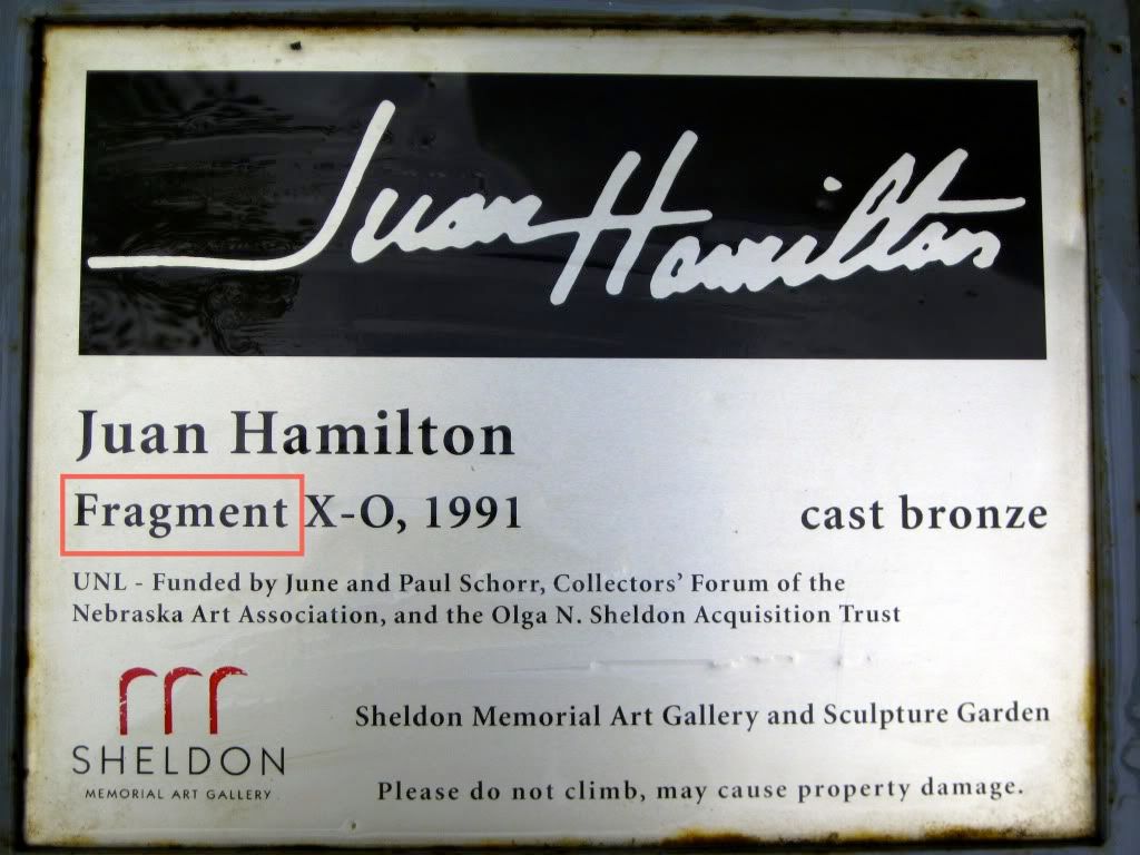
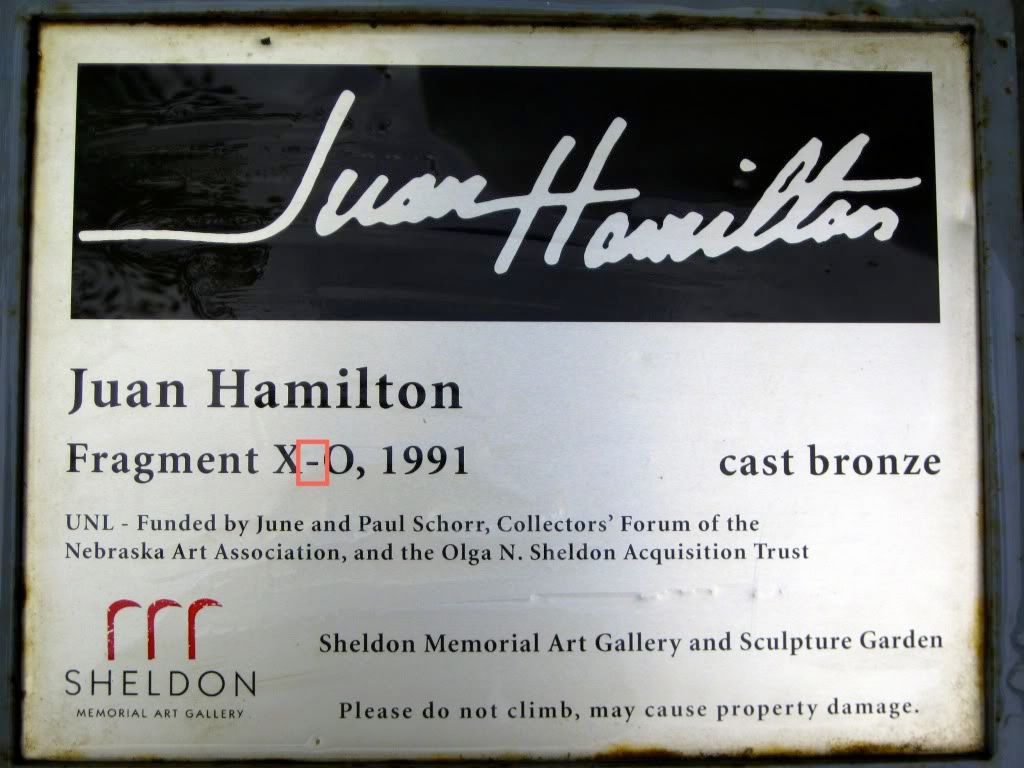
As a viewer approaches any piece of art, one of the first things considered is the title. This is particularly true of Fragment X-O, as its visual simplicity begs for explanation. Thus, the title is one of the most important and telling parts of the sculpture in terms of logos. This interaction between these words and the physical form helps to focus the audience to specific parts of the sculpture. In this case, the “words and [sculpture]… work together to have a larger effect than either alone has” (Wysocki and Lynch 302). From the beginning, this portion of the sculpture helps to aid in the argument that the sculpture is working to create. In the short title, “fragment” is the first word. This word works to immediately disregard the societal symbolism by creating a contrast between what is being seen (a complete circle) and what is being read. This word is one of the most important elements of the sculpture in terms of breaking down the societal expectations of what a circle is meant to represent.
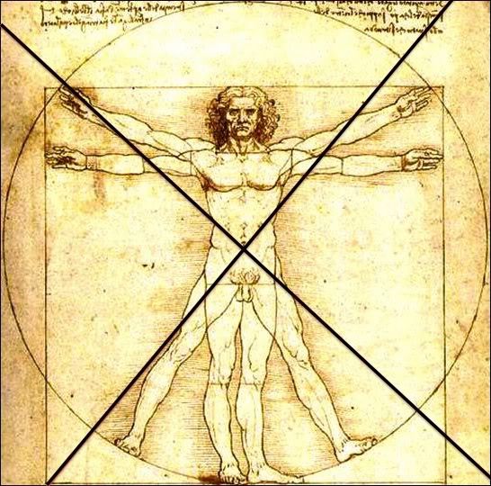
Next, the letter “X” appears in the title. This beckons the question, “where is the X?”. Well, it is nowhere in the sculpture. This is what is “fragmented” from the sculpture. The unity that is created by the use of the en-dash to connect the “X” and the “O” within the title is void in the sculpture. Again, here the sculpture is working against the idea of completeness that is associated with circles. This “X” also works to create a difference between the sculpture and the expectations of society because it adds another element to the circle, which is not included in the symbolism. Nonetheless, there are ways that this “X” can be added in using other materials outside of the sculpture itself. In respect to the framing aspect of this sculpture created the large empty center, another inanimate object could be introduced to the sculpture to complete it, or based on its size, a human could form the “X” by centering themselves in the hollow and spreading their legs and reaching their hands up to the sculpture, like DaVinci’s Virtuvian Man. In a way, a person would be imitating the title by also creating a connection between the “X” and the “O” through touch as the en-dash creates a connection between the “X” and the “O” in the title. By interacting with the art in such a manner, the physical constraints of the material are recognized by the audience in a way that no element within the sculpture could.
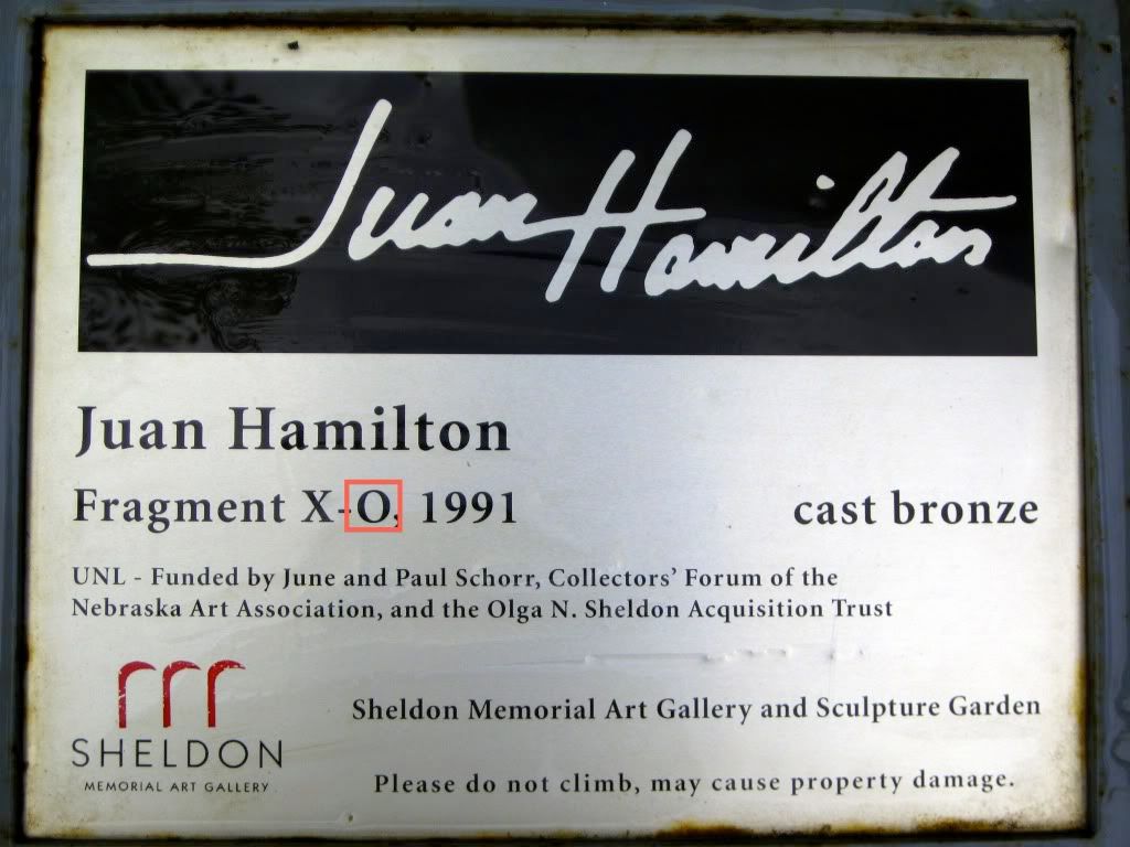
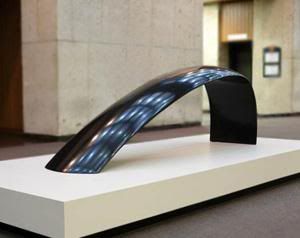
The “O” is the most important part of the title. The “O” is what is represented in this oversize bronze sculpture, shown to the left. But, there is a discontinuity between the letter “O” and what is presented. The letter “O” is perfect, complete and as tall as it is wide. It helps to form complete words and in many respects is also seen as a circle. The “O”-like circle is used as a symbol in western society for completeness and unity. However, the sculpture, Fragment X-O, is not perfect or unified in shape. It is wider than it is tall and parts of it are thicker than others. It is also not a perfect circle and does not even have the same color throughout. These imperfections are what help to form the argument. The irregularities work to show that even though this sculpture is a loose interpretation of a circle, many westerners will still try to associate it with the harmony of a circle. It is also working to create a material construct that cannot be disregarded as the audience looks to apply symbolism.

While the visual hierarchy does not work to further the argument, it helps to draw the audience into the sculpture above the others within the garden. The sculpture is placed in a clear hierarchy of the “element that first draws your attention being the largest and the darkest” (Wysocki and Lynch 287), however as this sculpture’s placement is examined further, it is noticed that it is placed upon a definitive concrete base. This base helps draw attention the sculpture by using contrast within the elements, namely between the highly structured, angled base and the soft lines of the sculpture. This contrast between these elements draws attention to the sculpture and ultimately draws the audience in to the argument that it is presenting.

The shape of the sculpture also works as an appeal to logos in the “arrangement of elements”. This simple, but imperfect Fragment X-O seems as though it should be easy to comprehend “because [it] does not ask much of visual effort from an audience” (Wysocki and Lynch 286). Nevertheless, it is this simplicity in shape that asks the audience to look past the simplicity to see the argument. The simplicity of the circular shape asks the audience to call to mind the association that they have with that shape and then through other elements within the sculpture it works to break down that association. Again, there is a disparity created between what is expected of the sculpture and what is actually there that helps the further the argument that it is forming.

The argument that the sculpture is working to create is also formed through the aesthetic elements. One of the first parts of the physicality noticed about Fragment X-O is that it is formed out of bronze. This bronze has interacted with the weather and the environment in which it is located in an interesting way. Through the weathering process, a variety of different hues have arisen on the patina of the sculpture. First of all, a saturated and dark red hue has developed on the inside of the ring. On the top outside a slightly unsaturated teal hue has developed. However, the dark bronze color has remained on portion of the sculpture that is closest to the ground. These hues all sit on opposite sides of the color wheel, which according to Compose, Design, Advocate “have the most contrast.” (Wysocki and Lynch 275). This contrast in the patina that is created through the various hues not only adds interest to the simple structure, but speaks to the argument as well. This coloration creates a sense of discord within the viewer that parallels the disagreement that the sculpture is creating between the symbolism that is applied by westerners and the material constraints of the sculpture. This variation in color is also not expected of a circle. Circles, in the western sense, are supposed to represent unity. So, again this variation in color is working to create a disparity in the physical construction.

Another aspect of the sculpture, which works to aid in the pathos, is the interaction of it with the environment in regards to lighting. One of the most important parts of the sculpture is its location outdoors. It interacts differently not only with the people that view it, but also the sunlight or lack thereof. On a bright, sunny day the sculpture seems to capture the light and then exude it outwards again. This makes the audience feel warm calm and tranquil as the light reflects off the soft curves. However, on a dull cloudy day the colors are dulled and the large “O” seems mysterious and foreboding. This contrast that is altered by the change in the weather also works to aid in the argument. The feelings that are evoked by the sculpture are different depending on “your specific cultural background [and] will shape your own specific response” (Wysocki and Lynch 274). This is also true of the symbolism that is applied to circular shapes. So, both of these factors are altered by our cultural backgrounds and the contrast created by the relationship between the weather and the sculpture help to illustrate this variation.

The placement of the Fragment X-O in the Sheldon sculpture garden adds to the overall argument that this sculpture is working to portray. Many of the other sculptures in the garden also embody parts of the hidden abstraction within Fragment X-O, such as Variable Wedge and Daimaru XV. These sculptures, which are in relative closeness to Fragment X-O, portray a similar theme to the argument that it is created for the disregard of the material constraints and continued use of the symbolism of unity and completeness that is applied to the shape of the circle by western culture. This argument is created through the use of rhetorical and aesthetic tools, such as logos through title interaction and arrangement of elements and pathos through coloration and lighting. Now that this argument has been created by this particular sculpture, what are the other sculptures around us saying? From the rest of the sculptures in the Sheldon Art Gallery sculpture garden to other art forms in our museums, each is working to create its own communication with its audience. So, next time you are at your local museum see if you can interpret what that painting on the wall is saying to you. Does this piece of art have something interesting to say about our world as Fragment X-O does?

Works Cited

University of Nebraska- Lincoln. Sheldon Memorial Art Gallery and Sculpture Garden. 2010. 20 April 2010 .

University of Texas at Austin. Juan Hamilton. 2010. 20 April 2010 .

Wysocki, Anne Frances and Dennis A. Lynch. Compose, Design, Advocate. Pearson Education, Inc., 2007.

Tuesday, April 20, 2010

WP3: Rough Draft

The creation of art is as old as time. As long as humans have been around, art has been created, from hieroglyphs on the inside of cave walls carved by the ancients to the portrait of Mona Lisa painted by Leonardo DaVinci. In every case, art was created with a purpose to portray a specific person, idea, or abstract representation or to appeal to the viewer’s emotions in a specific way. Some of the most interactive art are sculptures that are presented in a way in which the audience can explore and connect with the piece. One of the best environments for contact with sculpture is in a sculpture garden outdoors, where the art is readily available and it can interact with its surroundings as well as the people walking through. One such garden is the sculpture garden associated with the Sheldon Art gallery.

One of the most intriguing pieces of art in the garden is Fragment X-O by Juan Hamilton. Juan Hamilton is an artist that began his career by working with clay and creating pottery. He eventually moved into working with the bronze exemplified by Fragment after he went to study under Georgia O’Keefe during her final years. His art was greatly influenced by hers in the sensual and fluid shapes that appeared in her paintings. Fragment was also highly influenced by the aesthetics of Zen Buddhism that Hamilton encountered while on a trip in Japan, as much of his art is. Hamilton was also fascinated by how his sculptures interacted with the environment, whether that is indoors or out. Similarly, all of Hamilton’s abstract sculptures were created with meaning and how he was influenced the world around him. Fragment X-O is a counterargument for the symbolism of unity and completeness that is applied to the shape of the circle by western culture. This argument is formed through the contrast created in the pathos of the aesthetic elements and the rhetorical use of logos in the title and arrangement of elements.

The most obvious part of any art object is the physical and aesthetic portions. One of the first things that is noticed about Fragment is that it is formed out of bronze. This bronze has interacted with the weather and the environment in which it is located in an interesting way. Through the weathering process a variety of different hues have arose on the patina of the sculpture. First of all, a saturated and dark red hue has developed on the inside of the ring. On the top outside a slightly unsaturated teal hue has developed. However, the dark bronze color has remained on portion of the sculpture that is closest to the ground. These hues all sit on opposite sides of the color wheel, which according to Compose, Design, Advocate “have the most contrast.” (Wysocki and Lynch 275). This contrast in the patina that is created through the various hues not only adds interest to the simple structure, but speaks to the counterargument as well. This coloration creates a sense of discord within the viewer that parallels the disagreement that the sculpture is creating between the symbolism that is applied by westerners and other views.

Another aspect of the sculpture, which works to aid in the pathos, is the interaction of it with the environment in regards to lighting. One of the most important parts of the sculpture is its location outdoors. It interacts differently not only with the people that view it, but also the sunlight or lack thereof. On a bright, sunny day the sculpture seems to capture the light and then exude it outwards again. This makes the audience feel warm calm and tranquil as the light reflects off the soft curves. However, on a dull cloudy day the colors are dulled and the large “O” seems mysterious and foreboding. This contrast that is altered by the change in the weather also works to aid in the counterargument. The feelings that are evoked by the sculpture are different depending on “your specific cultural background [and] will shape your own specific response” (Wysocki and Lynch 274). This is also true of the symbolism that is applied to circular shapes. So, both of these factors are altered by our cultural backgrounds and the contrast created by the relationship between the weather and the sculpture help to illustrate this variation.

As the attention is drawn away from the physical form of the sculpture, the plaque card that accompanies the sculpture is considered. The most important part of this nameplate is the title of the particular sculpture, Fragment X-O. This is one of the most important and telling parts of the sculpture in terms of logos. This interaction between the words and the physical helps the focus of the audience to be placed on specific parts of the sculpture. Specifically in this case, the “words and [sculpture]… work together to have a larger effect than with alone has” (Wysocki and Lynch 302). From the beginning this portion of the sculpture helps to aid in the counterargument that the sculpture is working to create. In the short title, “fragment” is the first word. This word creates an immediate contrast between the sculpture and the title. In western culture, the circle or “O” typically symbolizes totality. The word “fragment” tosses this association to the side immediately and creates a distinct sense of discord between what is being seen and what is being read.

Next of all, the letter “X” appears in the title. This beckons the question, “where is the X?”. Well, it does not appear. This is the fragmented portion of the sculpture. The western association of the symbolism of X and O together are hugs and kisses, respectively. These are two forms of affection or salutation that usually work in tandem. This symbolism in western society also adds to the disparity that is created with the missing “X”. The unity that would have been created with the “X” appearing alongside the “O” has become void. Nonetheless, there are ways that this “X” can be added in using other materials outside of the sculpture itself. In respects to the framing aspect of this sculpture with the large empty center, another inanimate object could be introduced to the sculpture to complete it, or based on its size, a human could form the “X” by centering themselves in the hollow and spreading the legs and reaching the hands up to the sculpture. This interaction with its audience allows the audience to actively participate in completing symbolism of unity that is created by their society.

While the unity can be created by the audience that the title lacks, there is a unity in the title that can help connect the sculpture with the fragmented title. One of the most important, but unrecognized portions of the title is the en-dash that helps to join the “X” and the “O” together. This en-dash unifies the non-existent “X” and the present “O” just as the “O” signifies unity and completeness. While the sculpture is working to provide a counterargument in its interactions with the title and other elements, parts of the title are also working in contrast to create a similar counterargument.

The “O” is the most important part of the title. The “O” is what we have represented in this oversize bronze sculpture, shown to the left. But, there is a discontinuity between the letter “O” and what is presented. The letter “O” is perfect, complete and as tall as it is wide. It helps to form complete words and in many respects is also seen as a circle. This circle is used as a symbol in western society for completeness and unity. However, the sculpture, Fragment, is not perfect or unified in shape. It is wider than it is tall and parts of it are thicker than others. It is also not a perfect circle and does not even have the same color throughout. These imperfections are what help the make the argument. This disconnect between the “O” in the title and the “O” that is formed in the sculpture that detracts from the western symbolism of harmony that is applied to circles. This circle is not harmonious in its structure–it is imperfect and lopsided.

The shape of the sculpture also works as an appeal to logos in the “arrangement of elements”. This simple, but imperfect Fragment seems as though it should be easy to comprehend “because [it] does not ask much of visual effort from an audience” (Wysocki and Lynch 286). Nevertheless, it is this simplicity in the shape that asks the audience to look past the simplicity to see the argument. Again, there is a disparity created between what is expected of the sculpture and what is actually there that helps the further the counterargument that it is forming.

On the other hand, the visual hierarchy of logos created by the sculpture does actually work to create what is expected. The sculpture is placed in a clear hierarchy of the “element that first draws your attention being the largest and the darkest” (Wysocki and Lynch 287), however as this sculpture’s placement is examined further, it is noticed that it is placed upon a definitive concrete base. This base helps draw attention the sculpture by using contrast within the elements, namely between the highly structured, angled base and the soft lines of the sculpture. This contract between these elements draws attention to the sculpture and ultimately draws the audience in to the argument that it is presenting.

The placement of the Fragment X-O in the Sheldon sculpture garden adds to the overall argument that this sculpture is working to portray. Many of the other sculptures in the garden also embody parts of the hidden abstraction within Fragment such as Variable Wedge and Daimaru XV. These sculptures, which are in relative closeness to Fragment, add to the counterargument that it is creating for the symbolism of unity and completeness that is applied to the shape of the circle by western culture. This argument is created through the use of rhetorical and aesthetic tools, such as pathos and logos through title interaction and arrangement of elements. Now that this counterargument has been created by this particular sculpture, what are the other sculptures around us saying? From the rest of the sculptures in the Sheldon Art Gallery sculpture garden to other art forms in our museums, each is working to create its own communication with its audience. So, next time you are at your local museum see if you can interpret what that painting on the wall is saying to you. Does this piece of art have something interesting to say about our world as Fragment X-O does?


Works Cited

University of Nebraska- Lincoln. Sheldon Memorial Art Gallery and Sculpture Garden. 2010. 20 April 2010 .

University of Texas at Austin. Juan Hamilton. 2010. 20 April 2010 .

Wysocki, Anne Frances and Dennis A. Lynch. Compose, Design, Advocate. Pearson Education, Inc., 2007.

Sunday, April 18, 2010

Statement of Purpose: WP3

Art is all around us, from cover on that new CD you bought or that sculpture that you pass on the way to class everyday. Each of these pieces has a purpose and a meaning that is constructed through the visual elements and the interaction of the physical with the symbolic. This creation is as true with any piece of art as it is with Fragment X-O by Juan Hamilton.

When constructing my analysis of Fragment X-O, I have to be purposeful and effective. In analyzing another type of communication it is important that I successfully incorporate as many of the ideas that the sculpture is portraying. If I accomplish this task I hope to help my audience think differently about Fragment and art in general by considering all aspects of the piece, from the actual art-form to the description that accompanies it. I hope to inform and educate my audience about the argument, or rather the counterargument, that Fragment has created. The counterargument is created through the contrast within aspects of the aesthetic pathos and rhetorical use of logos, both with the title and environment interaction, for the symbolism that is applied to everyday objects to create meaning for a society, in this case the symbolism of a circle within the view of western culture. I hope to enlighten my audience on how this argument can be portrayed through a piece of art, something that is not widely considered as a form of communication.

My analysis viewed primarily by a specific audience. I am familiar with this audience and the situation in which they will encounter my essay so I have to be especially considerate of these individuals during the writing process. My primary audience will consist of my teacher and fellow classmates in a revision setting. These individuals will also be equipped with the same knowledge and terminology that I have. Both of these factors are the most important to take into account because they allow my audience to already have insight into my topic and have a critical eye for the ideas presented in my essay. However, my secondary audience will consist of other bloggers and internet users surfing the world wide web that will have little background for my topic. These individuals are also important to consider when crafting my essay because it must also inform and appeal to this audience. As well as a variety of audiences that will encounter my essay, the contexts in which it could be viewed also vary greatly.

This is the most open-ended consideration of the construction of my essay. I have very little control of when and where my various audiences will encounter my essay. The contexts will also range from an academic to recreational situations. This is due to the fact that my essay will be posted on a blog available to everyone that has access to a computer and the internet. It is also important to consider the time frame in which my essay will be viewed. It must be as applicable and relevant tomorrow as it will be years from now because of its existence on the internet and the permanence of Fragment X-O. Once it is posted on my blog, it will remain there forever, for everyone to see. With these variables in mind, I must be considerate of the wide variety of contexts in which it can be viewed and received.

The art that surrounds us is a major part of the communication within our society. One of these communicators is Fragment X-O by Juan Hamilton. I hope that my analytical essay will shed some light on argument that Fragment and other pieces are portraying. But, if I am unsuccessful in the analysis of the counterargument created by the sculpture my audience will not trust my ethos as a communicator and will ultimately disregard the piece of art that I had hoped to enlighten them about. In both scenarios, whether I accomplish my goal or not, the audience will be the deciding factor. Thus, I truly hope that I will effectively communicate the counterargument of Fragment X-O so that it appeals to the various members of my audience in their own context and that I have helped them to translate what that sculpture is portraying as they pass it on the way to class.

Saturday, April 17, 2010

WP3: Pre-Write 4

Fragment X-O was created by Juan Hamilton, who was born in 1945. He began his career as a potter and worked largely with clay. His career was furthered by his interaction with Georgia O’Keefe. As a classic American artist, she painted masterpieces that have a simple, yet sensuous feel to them and she used bold shapes and colors. Hamilton actually lived with her as a confidant and caretaker in the later years of her life after the death of her husband until her own death in 1986. His close interaction with O’Keefe and his origins as a potter likely influenced the creation of Fragment in the fluid lines and smooth construction. It seems as though he took the same approach to working with the bronze of this sculpture as to working with clay when potting. The influence of O’Keefe is reflected in the boldness of the shape and the soft, simple lines created within the “O”.

Hamilton’s art was also influenced by Zen Buddhism. He first encountered this fresh world view on a trip to Japan in 1970. He worked to capture the philosophy and aesthetics of this religion in his sculptures. His abstract forms developed out of this fascination and he has said that “they come from inside me. I feel them three-dimensionally in the center of my chest.” This sculpture is also perhaps a representation of the innermost portions of the body from Hamilton’s perspective.

Much of Hamilton’s art is also related to Fragment. His sculptures tend to be created from the same bronze metal and have similar smooth edges. He also has a trend of creating circular forms similar to Fragment. These purely abstract forms all share smooth, dark forms that reflect light and interact with their environment in specific yet very different ways, whether it be in the outside world or inside a museum filled with artificial light. However, despite these similarities the most distinct difference that is in the titling of Fragment. This title captures the audience and makes them take a closer look at the seemingly simple form before them. While the other titles of his pieces are descriptive and informative, like Portrait #2 or Curve and Shadow #2, the title of this large circle is not necessarily informative but thought provoking and beckons as many questions as the sculpture is large.

This piece, Fragment, stands out among Hamilton’s sculptures not only in shape and size, but also in the name. However, this piece also shares many similarities to these other pieces that helps to further the understanding of the origins of this piece in relationship to the artist.

Tuesday, April 13, 2010

WP3: Pre-Write 3

A few of the most interesting aspects of Fragment X-O by Juan Hamilton are its overall structure and placement in the world. This sculpture is located among many other sculptures in a garden purely meant for display, but there is something different about how this sculpture is situated that pulls the viewer in to examine it further.

This piece of art is most interesting because it can be viewed from many different angles and how this creates a sense of logos. Its location in an open environment in which the audience can move around and get as close to or far away from the sculpture as possible is what makes this viewing experience unique. Fragment looks different depending on which angle you are viewing it from. The front looks completely different from the back in the sharpness of the angles and the physical shape. The other interesting part about this piece is that the angle you are viewing the piece from alters what slice of life that you view through the center. The frame that is created by the sculpture highlights different aspects of the world around it and the placement of the viewer’s body in relationship to the sculpture alters how much is framed by the piece.

Also intertwined with the aspect of the sculpture that controls what you see through the hole, or what pieces that you see within it, is defined by its location within the sculpture garden. It is placed above the common viewing area separated from the sidewalk by grass. If the piece is viewed from the front, it partially frames Architecture Hall behind it, but when viewed from the backside it perfectly frames Sheldon Museum of Art. This intentional placement alters how the pathos of the viewer is affected as they look at the piece because of what they are also seeing behind it. As well, the sculpture is anchored to a large concrete slab that peaks above ground level. This slab gives an illusion of distance and creates a space in which the viewer is not allowed to get closer to the sculpture. This distance between the audience and the sculpture creates a lack of audience interaction that is contradicted by the piece’s life size and welcoming empty center. This works to create a sense of ethos so that the piece is respected as art and should not be touched or climbed on.

Another aspect of the sculpture that relates to visual pathos is the coloration of the art object. This piece is altered by the weather and as it is made of bronze this weathering alters the coloration. A gradient of color is created by this weathered effect that works to create an emotional response by the audience. The top of the sculpture has been weathered to create a greenish, matte patina, while on the other hand the bottom of the sculpture has retained its dark, shiny bronze coloration. The inside of the sculpture has taken on a red, rusty look very different from the outside of the piece. These colors work together to create a natural feeling that the piece is being incorporated by nature into its outside environment. This feeling invites the audience to touch and feel the material that is not felt in a museum environment. This interaction is not seen in many pieces because they are always viewed indoors and have a hands-off look about them, such as Curve and Shadow No. 2 also created by Hamilton.

Fragment X-O is full of contradictions and never looks the same from any angle. It is almost like looking at four different sculptures in one. This irregularity is created by its imperfections and natural-made feel.

Monday, April 12, 2010

WP3: Pre-Write 2

The sculpture Fragment X-O by Juan Hamilton appeals to an audience in a variety of ways. First of all, this piece of art appeals to a person’s pathos through its fluid structure and coloration to pull in the emotions of the viewer. This piece also uses logos and ethos to work with the audience to create an argument.

Pathos is the main rhetorical appeal at work. The fluid shape and soft edges of this object evoke a feeling of calmness. However, the dark hues of the bronze also works to induce questioning and mystery among the viewers. The interaction of this piece with the environment in which it is placed is also important to the overall feeling that it creates. The weather creates a distinct look to the piece. When the sun is shining off the bronze, the piece feels much more tranquil and at ease. On the other hand, when Fragment is shrouded in overcast skies or shadows it seems much more ominous and mysterious. These contradictions within the simplicity of the piece are also at work when looking at how it appeals to an audience’s logos.

The logos of the piece is mostly seen in its overall simplicity of shape and placement. It is placed within a simple patch of grass, free from the distractions of any other sculptures. Its large, oversize and dark shape makes it noticeable but also seemingly easy to comprehend. A visual hierarchy is also created by how the fluidity of Fragment contrasts with the sharp edges of the buildings and tree trunks surrounding it. It draws attention to itself by being one of the more circular shapes in the sculpture garden among the sharp edges of the other sculptures. As well, how the title of the piece interacts with the physical portion is important to logos. The title, Fragment X-O, directs the audience towards the emotional side of the piece due to their cultural background of associating X’s and O’s with kisses and hugs, respectively. The word “fragment” makes the audience wonder where the X is to this O, or if there even is one. This title works with the piece to explain what the artist was thinking about when he was creating the piece.

This consideration of what the artist was thinking about plays into how the ethos of the piece is portrayed to the audience. First of all, the polished look of the piece and its official placement in the sculpture garden among other famous pieces gives it credibility. Both of these aspects of the sculpture shows that the artist has experience with the material and allows the audience to trust the artist and what he is working to portray with the piece. The other feature of the piece that works to appeal to the audience’s ethos is how the sculpture focuses the attention beyond the piece itself into the world beyond. It works to frame life within the hole in the center. This focus tells us what the artist (and the installer) wanted us to see besides the piece itself.

All of these aspects of Fragment X-O work to portray an argument to its viewers and allows the piece to work beyond just being art, but also working as a communicator.

Wednesday, April 7, 2010

WP3: Pre-Write 1

I feel as I have had a lot of experience with different types of art. I come from a very artistic and art-interested family; my Dad was even an art major for a period of time in college. As well as my immediate family, many of my extended family is also interested in art forms. Further, many of my friends also share a passion for art, from drawing and painting to music. The love for numerous aspects of the art world in the people that surround me has pushed me towards growing appreciation for the arts as well.

Family is the main place that I experience art. Most family vacations include a trip to an art museum or gallery of some sort, no matter the destination. My dad is passionate about creating art as well as viewing other’s work. Two of my favorite museums are the Denver Museum of Contemporary Art and the Nelson-Atkins Museum of Art in Kansas City. His passion for creating art has also caused me to become involved in the creation of my own. I’m not sure if what I create could necessarily be considered art, but I do like to create what my mom calls “functional art” in the form of pottery bowls and mugs. Others in my family are also artists, in the ‘functional’ sense (my grandpa and uncle are woodworkers). This forced assimilation into the art world on the part of my family has caused me to become appreciative of the innovation of those that can create masterpieces.

Many of my friends are also interested in art. Instead of going to museums and looking at other’s art, they like to create their own. I have several friends that are avid sketch-artists and painters. One of my good friends is also interested in art in the musical sense. She listens to all types of music from reggae to old-school jazz and is also involved in band and improv groups. Her passion for music has also allowed me to experience art in the audio sense.

Overall, I would say that I have a well-rounded experience with art objects. The more art that I am exposed to, the more appreciation I have for paintings from long ago to modern sculpture. I am excited for the experience to learn how to analyze art-objects on a deeper level.

Monday, April 5, 2010

WP2: Final Draft

Author's Note:

Comics are my favorite part of the Sunday newspaper. For this project, I chose a comic from one of my favorite comic artists, Dan Piraro creator of Bizarro. After learning how aesthetic and rhetorical techniques employed by the artist help to create an argument for everyday life through a combination of text and visual components, I have begun to look at what I once thought were created just for a good laugh.

After careful analysis of my comic and picking out the tools that aided the argument within the comic the most I was ready to begin my first draft. My rough draft was mostly a compilation of my ideas that lacked any real structure. After the first peer review, I was given some great comments from my peer reviewer to help further the ideas I had already presented on a local level. One of the ways that I worked to improve my first draft was to revisit the topics I had covered in the body of my essay, such as the rhetorical use of text, and as suggested by my peer reviewer, Sarah, add these topics to my thesis so that they were also covered in my introduction. In the body of my essay, I also looked at organization. I felt that some of my topics had been too grouped together, so I split several paragraphs up to create small paragraphs in which to focus on each device used in the comic. The two places that I made these divisions were in the paragraph about text and the paragraph that dealt with visual constraints. I wanted to see how creating small blocks of text with less ideas presented within them would work for the second draft. One of the smaller changes from the first to the second draft, but that I thought made some of the most difference was at the end of the conclusion. As suggested, again, by Sarah, “maybe instead of just asking the question [at the end of the paragraph], either before or after elaborate a little more on how it [misreading historical artifacts] is present in other aspects of our society”. She suggested including other places where our society had misread a text and developed it into some form of entertainment, such as The Davinci Code. Her suggestions on this part of my essay helped to enhance the “so what?” portion that is the ultimate question I was trying to answer. The first draft was very weak in this area, but her suggestions helped to tie this portion of the essay back in with the introductory paragraph.

There were many more changes that occurred between the second and final drafts. In my introduction, I made sure to again tamper with my thesis statement. As stated by my second peer reviewer, Amberley, “the whole thesis statement is a little long. Try to simplify this so that it is clear and concise!”. I felt the same way but was not sure exactly how to go about this change. With her help, I decided to make my one thesis statement into two sentences so that I could include all the information without loosing the meaning. The body of my second draft also went through several major revisions. After using smaller paragraphs in the second draft, I decided to return to the basic original structure. Some of the paragraph divisions I made for the second draft did not help to remove confusion, they only added to it. While completing this, I also made some major additions to each paragraph by expanding on each idea as suggested by Amberley, “I think just expanding on your subjects could really help…detail your essay a little more. You have a good foundation, just building it up a little will help!” This expansion helped to fully explain each idea and provide evidence to how each topic I touch upon helped to further the argument of the comic. After expanding on each topic individually, I was able to make some of the needed global changes in paragraph divisions. However, these divisions were based on necessity to help the reader break from one idea to the next instead of focusing on one part of an analysis in each paragraph.

Through every revision, as I was improving my essay, I also discovered that comics can contain more commentary than I thought possible. The superficial argument usually gives way to deeper meaning within the comic that is highly affected by how the artist manipulates the medium. This discovery has lead me to look at the comics page a little closer on Sunday mornings while flipping through the paper.

Draft 2

Draft 1

Statement of Purpose

Final Draft:


The apocalyptic movie has become a staple within the film making industry. Fans of this genre flock to the theatres to experience the thrill and the more realistic the drama, the better. But, the most successful of these movies are the ones that create a fictional narrative based on historic artifacts or events, such as the very real 2012 phenomenon that prompted the creation of the movie, 2012. This film is based on the fears that arose as people discovered that the Mayan calendar, created some three thousand years ago, ended on the Winter Solstice of the year 2012. This arbitrary end to such an influential and superstitious culture’s calendar caused people all over the world to develop their own hypothesis for why the calendar ended on such a date. The consensus was that the Mayans knew something would happen on that exact date centuries later, causing the world as we know it to cease to exist.

As well, the apocalyptic comic has also become a staple within the entertainment industry. Or rather these comics are just a commentary to the apocalyptic phenomenon that arose with the turn of the twenty-first century, Y2K. The always socially and culturally conscious, comic series, Bizarro, developed by Dan Piraro has come up with its own explanation for what has become known as the ‘2012 Phenomenon’. The aesthetic and rhetorical use of logos through text and visual constraints, as well as pathos through humor help to develop the argument (or explanation) created within the December 21, 2009 Bizarro comic. This argument is that as a society we misread and negate the material constraints of a text and instead lay our own narrative over that text that undermines the importance and original purpose for that specific communication, in this case the Mayan calendar.

The first part of the panel that is noticed when viewing the Bizarro comic is the text. The hierarchal arrangement of the dialogue bubbles in the top middle of the panel attracts the viewer’s attention. This attention-grabbing technique works “because we have learned to read from top to bottom and left to right.” (Wysocki and Lynch 287) The placement of the dialogue bubbles, one over the top of the other, and the direction of the communication between the characters, from left to right, also comes into play with the techniques of visual hierarchy. Another reason that the eye is first drawn towards the dialogue is because of the simplicity of this area of the comic. The stark contrast between the black text and the cream background creates a simple, but attention-grabbing use of logos within the frame of the comic. This hierarchal and aesthetic approach to logos speaks to how we could misread a text. With the placement of the text above the visual elements, the viewer could misread the dialogue especially because it is supposed to work in conjunction with the visual images. The text could also be misread because of an anomaly in language.

There are two main ways in which the text is incongruent with the visuals and the context in which the characters are portrayed. The first way in which the text differs from the drawings is in the language. Based on the drawings, the characters in the panel are supposed to be Mayans. But, the text is written in English. This use of the English language caters to an English-speaking audience of mostly Americans. If this comic were to be accurate, historically, they characters would not be speaking English, they would be speaking in the Mayan language. This use of a predominantly American language instead of a historically accurate one aids in the creation of the argument that historic events and artifacts are misunderstood in current culture. Another anomaly created in the text is the way in which the dialogue is written. By using the phrase “freak somebody out,” a modern dialect is created within the comic and the use of contemporary slang creates a universalizing effect. This inconsistency between the historic content of the image and the vernacular used in the text also furthers the argument that misunderstandings occur when present-day society creates their own interpretation for historical artifacts and does not take into account the culture from which that piece arose.

The argument of the comic is also furthered by the visual constraints in which it was created. The use of a single panel is the main visual constraint of the comic. Whereas most comics contain three panels in which the story is told, this Bizarro comic is contained in just one. This limited area forces the commentary to be summed up in one small square. This undersized area also creates a focused effect on the argument of the comic at hand, allowing it to be more obvious to its readers. While a focus on the argument is an important part of how this comic is formed, there is a more important parallel created through the use of one panel to a specific element within the comic itself.

The Mayan calendar depicted in the frame of the comic is an important component of the visual structure. Its historically accurate and detailed depiction proves that this image is important to the overall argument created within the comic. As shown in the image at the left, this calendar was created in a circular fashion so that there was a finite amount of room available to its creator for the time in which he (or she) was incorporating. As so eloquently said by one the characters, “I only had enough room…”. Just as the comic only had one frame to tell its story, the calendar was also limited by the finite amount of room to keep time. This analogy created between the frame of the comic and the confines of the calendar aids in the argument of misunderstanding as well as the negating of material constraints. By using a single panel of a comic, a common art form of modern culture, it helps to explain how the ancient calendar could also have been constrained by its medium in a similar manner. In other words, the comic helps to “explain the unknown by the known”. (Wysocki and Lynch 306) This relationship between the various parts of the comic is not confined to the calendar and framing.

The interaction between the inaccurate narrative and argument that the comic is working to portray is what appeals to the pathos of the audience via humor. The narrative that has been laid over the Mayan calendar in popular culture for the reasons behind the end of the Mayan calendar on the Winter solstice is that this is when the Mayans thought the world would end. The humor is held in the argument within the comic, that they actually just ran out of room on their stone to continue moving through time. They way that this message is told to the audience through slang dialect by the character’s dialogue also adds to the humor. Another part of the comic that adds to the pathos used to further the argument is the portrayal of the characters. These characters are caricatures of what actual Mayans look like. This overall comedic theme throughout the panel helps to further the argument by appealing to the pathos of the audience in an everyday and humorous way that is communicated to a variety of audiences. This type of lighthearted communication is more likely to make an audience accepting of the argument that a creator is trying to form and this is especially true with the Bizarro comic.

Many comics contain an argument, whether it is underlying or in your face. Dan Piraro, creator of the Bizarro comics, has a more ‘in your face’ style than other comic artists. In the December 21, 2009 comic, this argument is as evident as ever. The argument of this particular comic is that as a society, we tend to misread and negate the material constraints of a text and instead lay our own narrative over it that undermines the text’s original purpose and importance. This argument is created through the utilization of the aesthetic and rhetorical techniques through the use of text, visual constraints, and pathos through humor. Now it has been suggested that as a society, we tend to overlay our own assumptions on the unknown in history. Not only do comics comment on this misunderstanding, but other parts of the entertainment industry as well, in books and movies. One of the most well known historical misunderstandings that has been popularized by the entertainment industry is the DaVinci Code novels and movie series. What else in the course of history has been misread and where else in the entertainment industry has this been displayed?

Works Cited:

Piraro, Dan. Countdown to Catastrophe. 21 Dec. 2009. BizarroBlog. blogger.com, 30 Dec. 2009. Web. 28 Mar. 2010.


Wysocki, Anne Frances, and Dennis A. Lynch. Compose, Design, Advocate. N.p.: Pearson Education Inc., 2007. Print.

Wednesday, March 31, 2010

WP2: Second Draft


The apocalyptic movie has become a staple within the film making industry. Fans of this genre flock to the theatres to experience the thrill and the more realistic the drama, the better. But, the most successful of these movies are the ones based on true events, such as the very real 2012 phenomenon that prompted the creation of the movie, 2012. This film is based on the fears that arose as people discovered that the Mayan calendar, created some three thousand years ago, ended on the Winter Solstice of the year 2012. This arbitrary end to such an influential and superstitious culture’s calendar caused people all over the world to develop their own hypothesis for why the calendar ended on such a date. The consensus was that the Mayans knew something would happen on that exact date centuries later, causing the world as we know it to cease to exist.

As well, the apocalyptic comic has also become a staple within the entertainment industry. Or rather, just a commentary to the apocalyptic phenomenon that arose with the turn of the twenty-first century, Y2K. The always socially and culturally conscious, comic series, Bizarro, developed by Dan Piraro has come up with its own explanation for what has become known as the ‘2012 Phenomenon’. The aesthetic and rhetorical use of logos through text, visual constraints, and pathos through humor help to develop the argument (or explanation) of the December 21, 2009 Bizarro comic, that as a society we misread and negate the material constraints of a text and instead lay our own narrative over that text that undermines the importance and original purpose for that specific communication, in this case the Mayan calendar.

The first part of the panel that is noticed when viewing the Bizarro comic is the text. The hierarchal arrangement of the dialogue bubbles in the top middle of the panel draws in the viewer’s attention. This attention-grabbing technique works “because we have learned to read from top to bottom and left to right.” (Wysocki and Lynch 287) The placement of the dialogue bubbles, one over the top of the other, and the direction of the communication between the characters, from left to right, also comes into play with the techniques of visual hierarchy.

Another reason that the eye is first drawn towards the dialogue is because of the simplicity of this area of the comic and the stark contrast between the black text and the cream background. This hierarchal and aesthetic approach to logos speaks to how we could misread a text. With the placement of the text before the pictorial portrayal of the characters and their props the text, the viewer could misread the dialogue especially because it is supposed to work in conjunction with the visual images. The text could also be misread because of an anomaly in language.

There are two main ways in which the text is incongruent with the visuals and the context in which the characters are portrayed. The main way in which the text differs from the drawings is in the language. Based on the drawings, the characters in the panel are supposed to be Mayans. But, the text is written in English. This use of the English language produces a universalizing effect for the reader, but it is false because these characters would not be speaking English, they would be speaking in the Mayan language. Another anomaly created in the text is the way in which the dialogue is written. By using the phrase “freak somebody out,” a modern dialect is created within the comic and the contemporary slang also has a universalizing effect. Both of these contrasting effects between the language and the images adds to the argument of misunderstanding that can occur when interpreting historic events and artifacts in a modern context.

The argument of the comic is also furthered by the visual constraints in which it was created. The main visual constraint in which the comic is confined is that it is a single panel. Whereas most comics contain three panels in which the story is told, this Bizarro comic is contained in just one so that all of the commentary must be summed up this one small square. This small area also creates a focused effect on the argument of the comic at hand, allowing it to be more obvious to its readers. This constraint of the size of the comic is especially reflective of a visual image within the panel.

The image that this is reminiscent of is the Mayan calendar depicted within the comic. This calendar was created in a circular fashion so that there was a finite amount of room available to its creator for the time in which he (or she) was incorporating. As so eloquently said by one the characters, “I only had enough room…”. The Mayan calendar was also only able to hold so much time with its circular, finite shape, just as the comic only had one panel to make its point. This similarity between the constraints created by the medium speak to how a historical artifact can be misread so that another, maybe inaccurate, narrative has been laid over the top of the artifact to create meaning for its audience.

The interaction between the inaccurate narrative and argument that the comic is working to portray is what appeals to the pathos of the audience via humor. The narrative that has been laid over the Mayan calendar in popular culture for the reasons behind the end of the Mayan calendar on the Winter solstice is that this is when the Mayans thought the world would end. The humor is held in the argument, that they actually just ran out of room on their stone to continue moving through time. They way that this message is told to the audience through slang dialect by the character’s dialogue also adds to the humor. Another part of the comic that adds to the pathos used to further the argument is the portrayal of the characters. These characters are caricatures of what actual Mayans look like. This overall comedic theme throughout the panel helps to further the argument by appealing to the pathos of the audience in an everyday and humorous way that is communicated to a variety of audiences. This type of lighthearted communication is more likely to make an audience accepting of the argument that a creator is trying to form and this is especially true with the Bizarro comic.

Many comics contain an argument, whether it is underlying or in your face. Dan Piraro, creator of the Bizarro comics, has a more ‘in your face’ style than other comic artists. In the December 21, 2009 comic, this argument is as evident as ever. The argument of this particular comic is that as a society, we tend to misread and negate the material constraints of a text and instead lay our own narrative over it that undermines the text’s original purpose and importance. This argument is created through the utilization of the aesthetic and rhetorical techniques through the use of text, visual constraints, and pathos through humor. Now that it has been suggested that as a society, we tend to overlay our own assumptions on the unknown in history. Not only do comics comment on this misunderstanding, but other parts of the entertainment industry as well, in books and movies. One of the most well known historical misunderstandings that has been popularized by the entertainment industry is the DaVinci Code movie series. What else in the course of history has been misread and where else in the entertainment industry has this been displayed?


Works Cited:

Piraro, Dan. Countdown to Catastrophe. 21 Dec. 2009. BizarroBlog. blogger.com, 30 Dec. 2009. Web. 28 Mar. 2010.


Wysocki, Anne Frances, and Dennis A. Lynch. Compose, Design, Advocate. N.p.: Pearson Education Inc., 2007. Print.