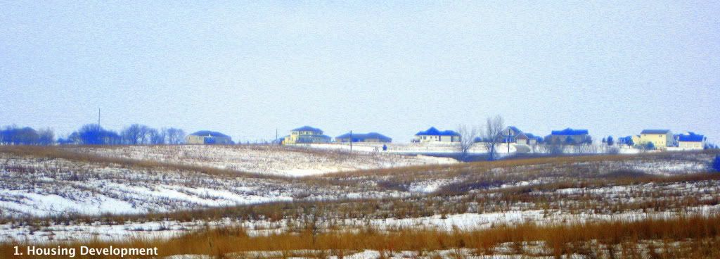

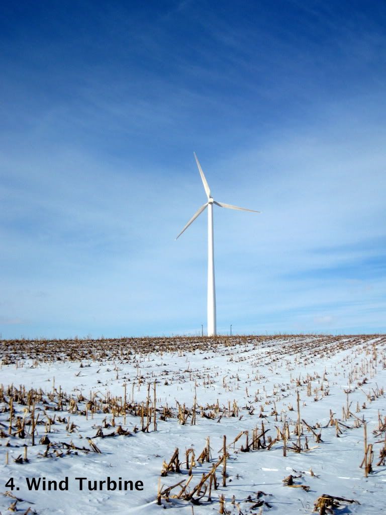
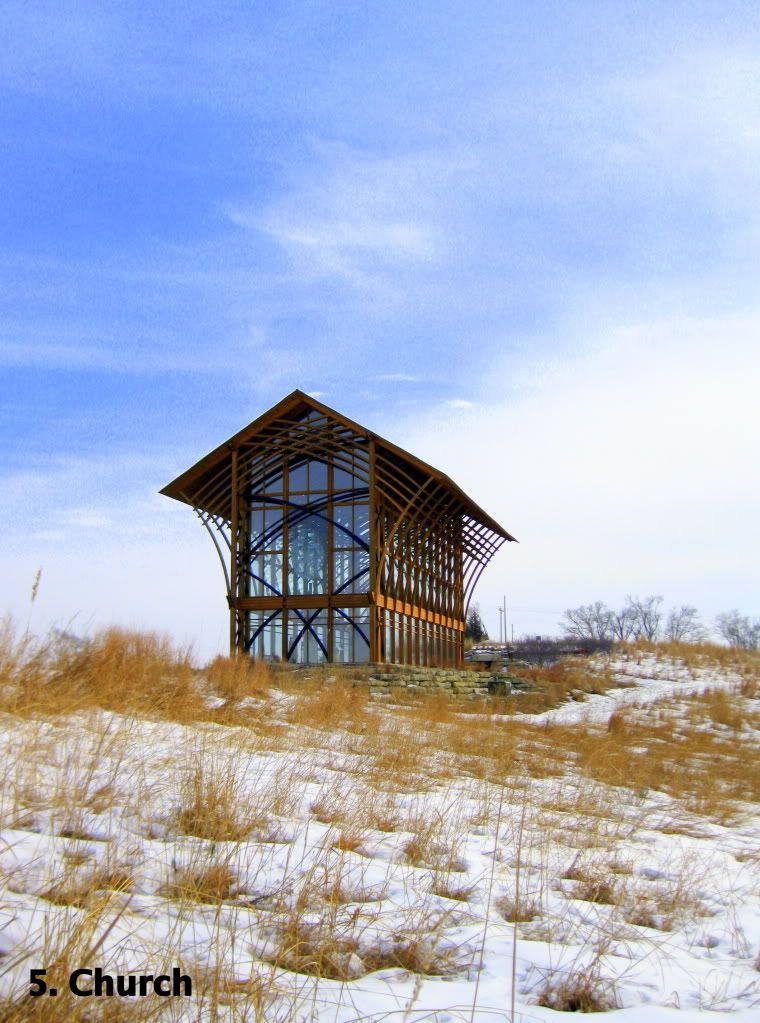
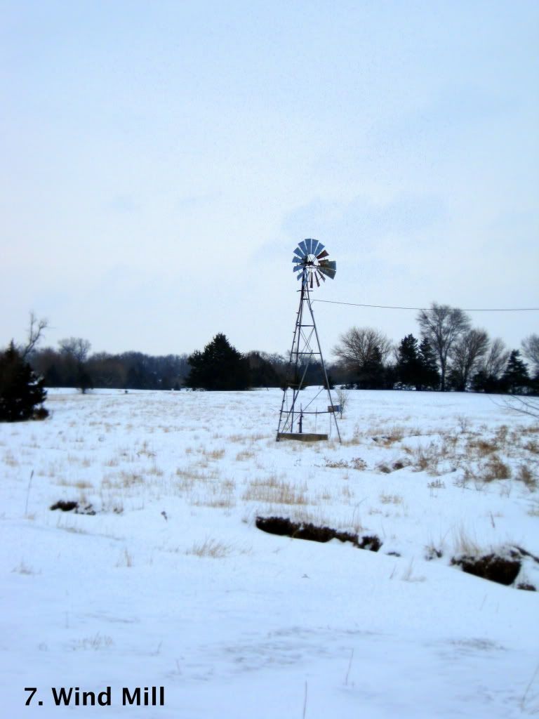

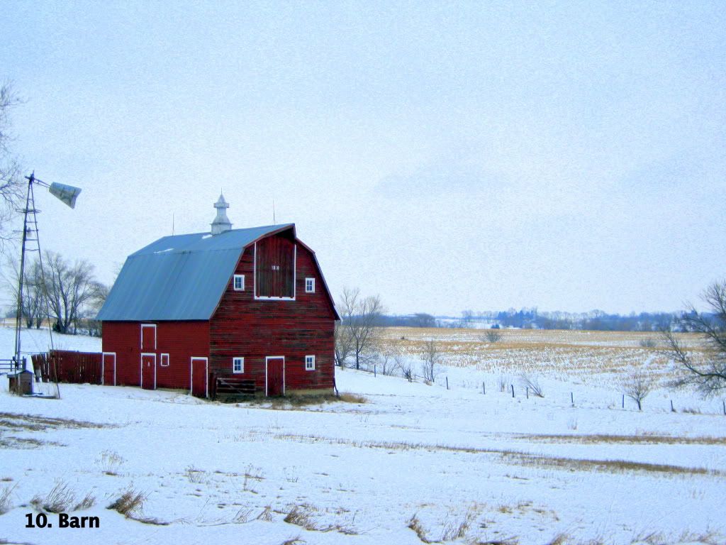
One of the hardest elements to tangle with was the lighting when taking these photos. Lighting can either make or break a photo, especially when you are dealing with natural sunlight. Several of my images did not make the cut the first time I took them because there was such little contrast between the human creation and bleak, gray hue of the sky making it was hard to discern where one ended and the other began- especially in Wind Turbine. So, I returned to the site of the photograph and tried again to capture the contract between the deep blue sky and the white turbine. One of the main places I utilized hue was in creating this contrast between the natural and the man-made, I wanted to create a feeling of dissonance between these parts of the photos. I tried to look for hues that are very different from one another to amplify this contrast. One of the best examples of this contrast according to hue is Barn. I also employed hue as a tying element throughout the essay– each photo is composed of a blue sky, tan ground, and the object being focused on. Saturation was another tool I used when editing these photos as a collection. I wanted these photos to be highly saturated to amplify the hues and give these photos a strong and eye-catching presence individually, as well as together as a visual essay. I also wanted this high amount of saturation to create a strong emotion in the audience when looking at the photos, whatever that feeling may be. Creating a sense of unity throughout the photo essay was important when taking and editing these photos that I employed not only through coloration, but through the arrangement of each of the elements of the images as well.
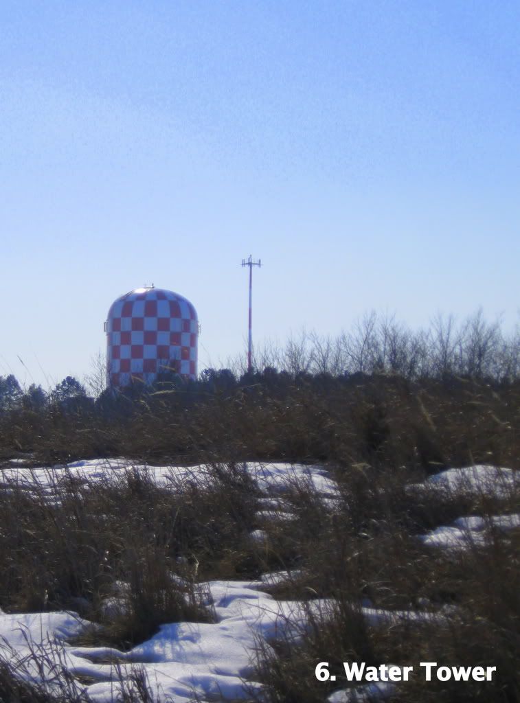
As suggested by Compose, Design, Advocate, I “limit[ed] [my]self to three to four elements” in each picture (286). This use of only three elements allowed me to keep my purpose and the relationships I was trying to portray straightforward as well as staying consistent with the simplicity of the environment I was capturing. I also used this small number of elements, again, as a theme throughout the essay. I wanted to make sure that each photograph looked like part of a collection, but could also function on its own. Visual hierarchy was also important in this aspect of the design process. I used visual hierarchy as a tool to direct my audience’s eyes through the aspects of the photos as they were viewing them. I made sure the item I wanted to be the focus of the photo was in the “top left or top middle. Because we have learned to read from top to bottom and left to right…” (287) One example from the collection of this arrangement is Water Tower. I used the horizon as a backbone for the arrangement, anchoring and dividing the image, and tried to create a visual path along this horizon for viewing ease. Creating a repetition throughout the photo essay was important when capturing each image, but I also wanted to make sure that each image was able to have meaning as a single photo.
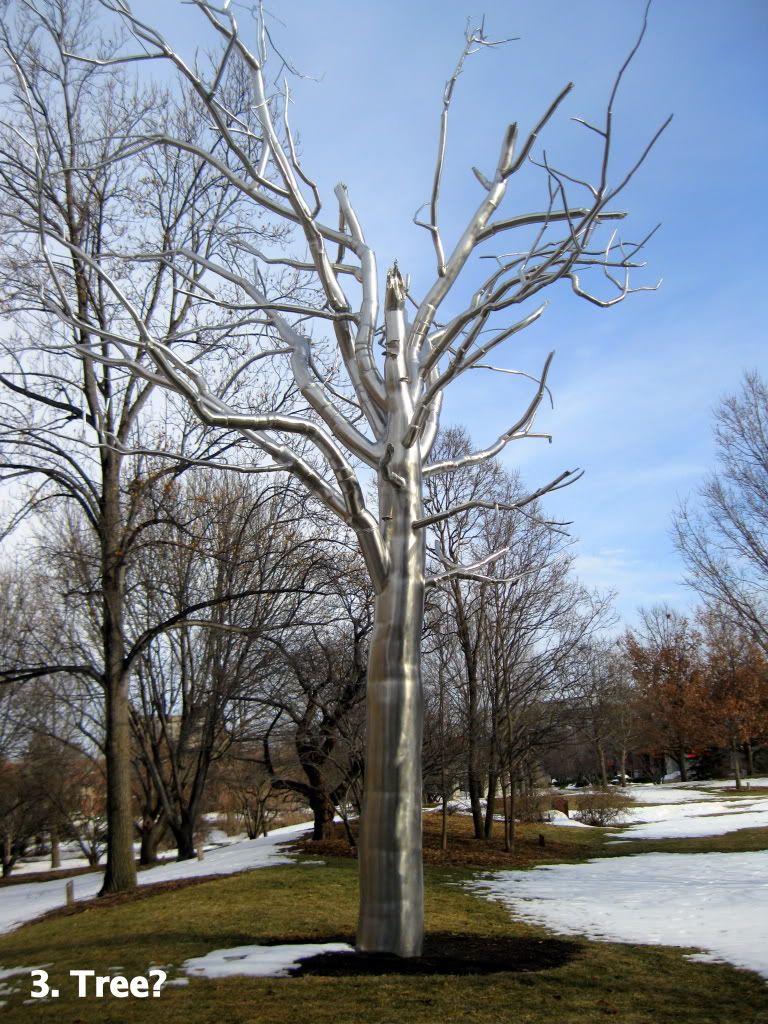
I used a variety of rhetorical techniques to create unity throughout the photo essay, but I also wanted to make sure that each photo spoke as an individual. When making sure that each image worked on its own, I focused on the framing of the photo as it was being taken and the cropping of the images once they were downloaded to my computer. When framing the photos, I wanted to make sure that I got a variety of shots from a variety of angles, so that I could later decide what part I wanted to most focus on in the shot. I also had to think about how I wanted my audience to be oriented in relationship to the subject of the photo. Sometimes this required me to put myself in shoes of my audience and think about how to orient myself to give them to best context for each image. This was especially important for Tree? because of the buildings in the background. I wanted to make sure that these buildings were not easily visible within the photograph, because I all of the other photos are just the subject and the environment without any other buildings or other distractions. Cropping was also important when thinking about my audience. I wanted to make sure that there was a sense of intimacy and closeness to subject, but to also create an even balance of distance as well. Cropping was also important when limiting the number of objects within the photos to make sure that there was that sense of simplicity.
In conclusion, there were many rhetorical techniques that went into the shooting and editing of each of the photographs in my photo essay. These techniques were pulled from the book Compose, Design, Advocate and utilized so that I could better communicate the argument within my photos to my audience. I used these rhetorical devices to appeal to pathos, ethos, and logos through coloration, arrangement, and framing that created a unity throughout my entire visual essay. I hope that all of the work that has gone into these photographs displays to my audience a sense of professional ethos as well as the argument. The simplicity of the Nebraska landscape has been an inspiration for me through the lens of my camera and I hope that these images I have captured will inspire my audience to look at their environment and interaction with it as well.
Works Cited:
Wysocki, Anne Frances, and Dennis A. Lynch. Compose, Design, Advocate. Pearson Education Inc., 2007.
No comments:
Post a Comment