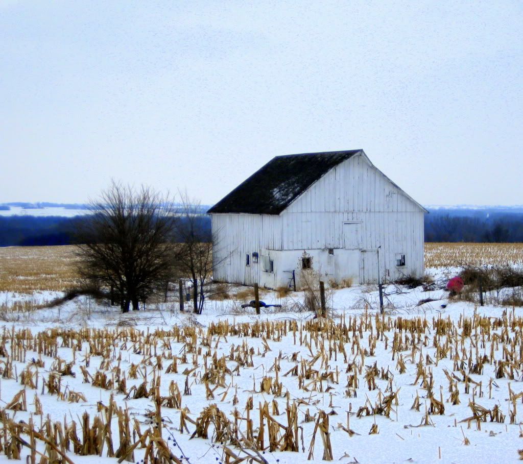
The countryside of southeastern Nebraska may seem monotonous to some, but this simplicity is what makes this landscape beautiful. On a clear February afternoon, when the sky is bluer than the ink of a ballpoint pen and the snow-crusted fields seem endless, the beauty is released from the eye beholder for everyone to see. But, the horizon is not uninterrupted, there is something in the way– something not made by Mother Nature, but by humans. This relationship between man and the environment is what inspired me to capture this series of photographs through the lens of my camera. With these images, I hope to create a dialogue with my audience that will inspire them to look closer at not only the interactions of humans in general, but their own interaction with the world. When capturing these photos, I used a variety of rhetorical techniques to appeal to the pathos, logos, and ethos of my audience through the use of coloration, framing and cropping.
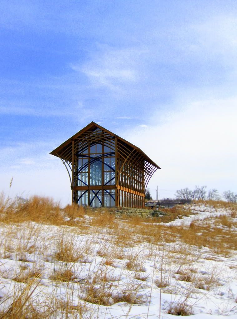
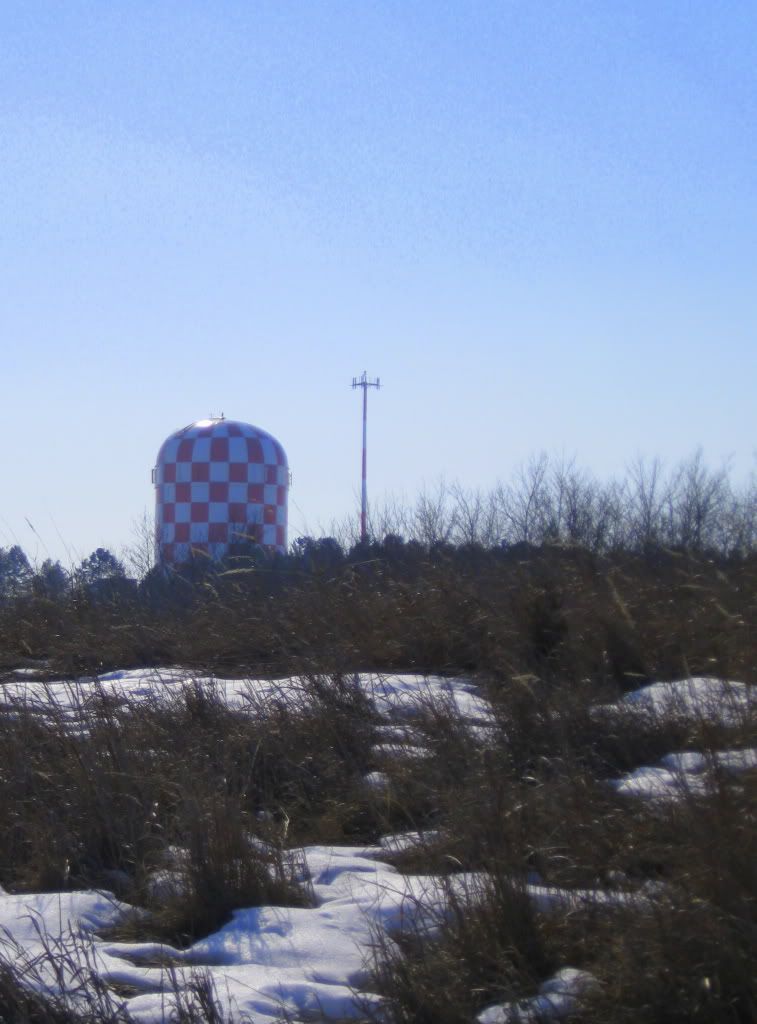
As well as saturation, I utilized hue in creating a contrast between the natural and the man-made. I wanted to create a feeling of discord between these parts of the photos to specifically appeal to the emotions of my audience. I tried to look for hues far apart from one another on the color wheel to amplify this contrast. One of the best examples of this contrast according to hue is Photo 10. I also employed hue as a tying element throughout the essay– each photo is composed of a blue sky, tan ground, and the object being focused on. Saturation was another tool I used when editing these photos as a collection. I wanted these photos to be highly saturated to amplify the hues and give these photos a strong and eye-catching presence individually, as well as together as a visual essay. I also wanted this high amount of saturation to create a strong emotion in the audience when looking at the photos, whatever that feeling may be. Creating a sense of unity throughout the photo essay was important when taking and editing these photos that I employed not only through coloration, but through the arrangement of each of the elements of the images as well.
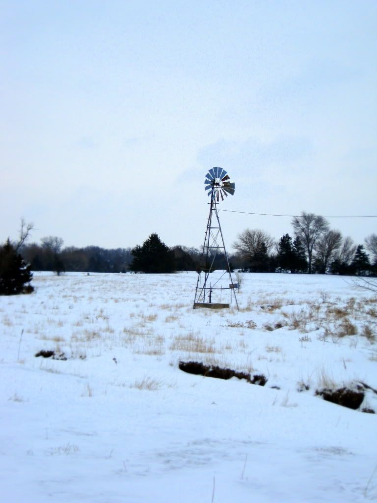
To appeal to the logos of my audience, I “limit[ed] [my]self to three to four elements” in each picture (Wysocki, Lynch 286). This use of only three elements allowed me to keep my purpose and the relationships I was trying to portray straightforward as well as staying consistent with the simplicity of the environment I was capturing. I also used this small number of elements, again, as a theme throughout the essay. I wanted to make sure that each photograph looked like part of a collection, but could also function on its own. When creating a prominent theme within the essay, I was able to allow my audience to see how each photo fit into the overall argument. Visual hierarchy was also important in this aspect of the design process. I used visual hierarchy as a tool to direct my audience’s eyes through the aspects of the photos as they were viewing them. I made sure the item I wanted to be the focus of the photo was in the “top left or top middle. Because we have learned to read from top to bottom and left to right…” (Wysocki, Lynch 287) One example from the collection of this arrangement is Photo 6. I used the horizon as a backbone for the arrangement, anchoring and dividing the image, and tried to create a visual path along this horizon for viewing ease. Creating a repetition throughout the photo essay was important when capturing each image, but I also wanted to make sure that each image was able to have meaning as a single photo.
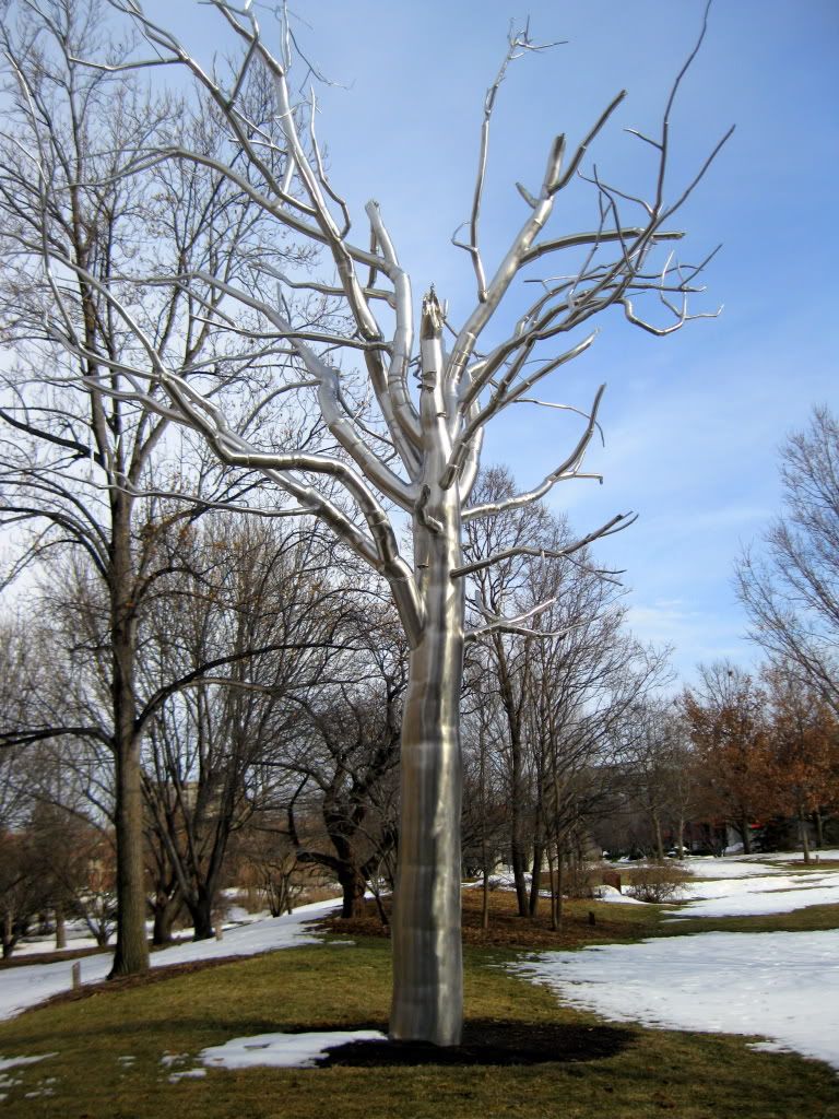
When making sure that each image worked on its own to appeal to the logos of my audience, I focused on the framing of the photo as it was being taken and the cropping of the images once they were downloaded to my computer. When framing the photos, I wanted to make sure that I got a variety of shots from a variety of angles, so that I could later decide what part I wanted to most focus on in the shot. I also had to think about how I wanted my audience to be oriented in relationship to the subject of the photo. Sometimes this required me to put myself in shoes of my audience and think about how to orient myself to give them to best context for each image. This was especially important for Photo 3, because of the buildings in the background. I wanted to make sure that these buildings were not easily visible within the photograph, because I all of the other photos are just the subject and the environment without any other buildings or other distractions. Cropping was also important when thinking about my audience. I wanted to make sure that there was a sense of intimacy and closeness to subject, but to also create an even balance of distance as well. Cropping was also important when limiting the number of objects within the photos to make sure that there was that sense of simplicity.
As, a novice photographer with a large interest in photography but little experience, creating a sense of ethos within my photos was of great importance as well as pathos and logos. As stated above, I used a small number of elements within each of my photos to keep consistent with the environment I was photographing, but I also limited the number of parts to my images to allow the photos to be easy to look at and have the attention be drawn to the main subject immediately. I did not want to make my audience search for the focus of the photo because “visual communication…[has] t[aken] on the values of quickness and directness”. (Wysocki, Lynch 270) The position that the photos were taken from also was taken into consideration in appealing to my audience. I wanted the perspective to remain consistent and allow each subject to be immediately recognizable. Both of these appeals work to, again, remain consistent to the efficiency that our society has adopted. The subjects of the photos, also specifically work to appeal to my audience and trust my decisions as the photographer. I chose places that are culturally relevant to the place in which we live. These subjects are common and everyday, but displayed in a way that looks at them from another point of view.
Works Cited:
Wysocki, Anne Frances, and Dennis A. Lynch. Compose, Design, Advocate. Pearson Education Inc., 2007.





No comments:
Post a Comment