When deciding which of the options to pick for Project one, it was a simple decision. I have a budding interest in photography and I was exhilarated to be given the opportunity to go out into the field, literally, and use the rhetorical and aesthetic tools that I had learned to create my own images. It was not always easy tromping through the fields to capture that perfect shot but in the end it was well worth it.
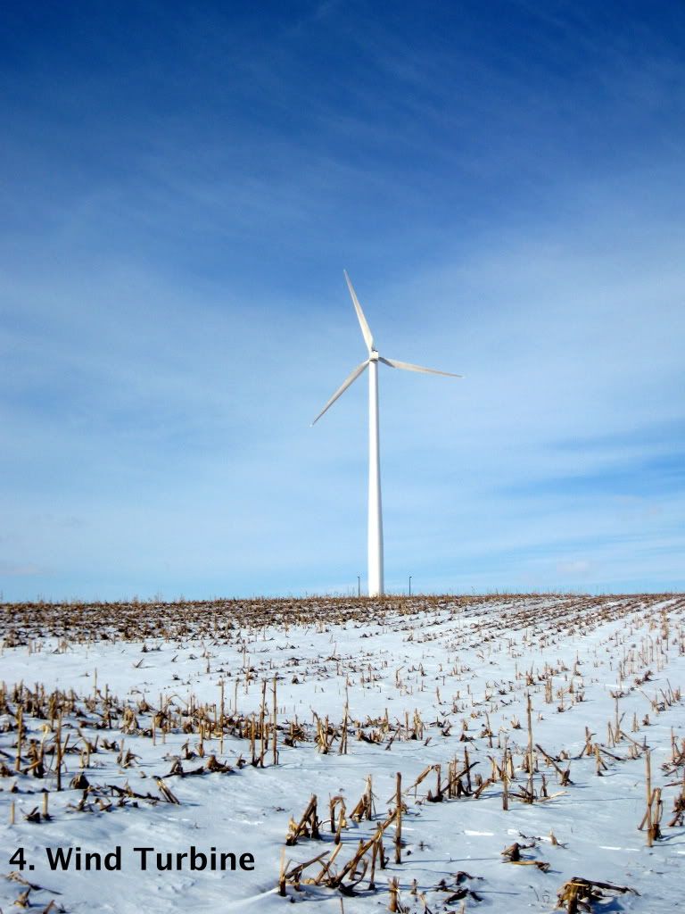
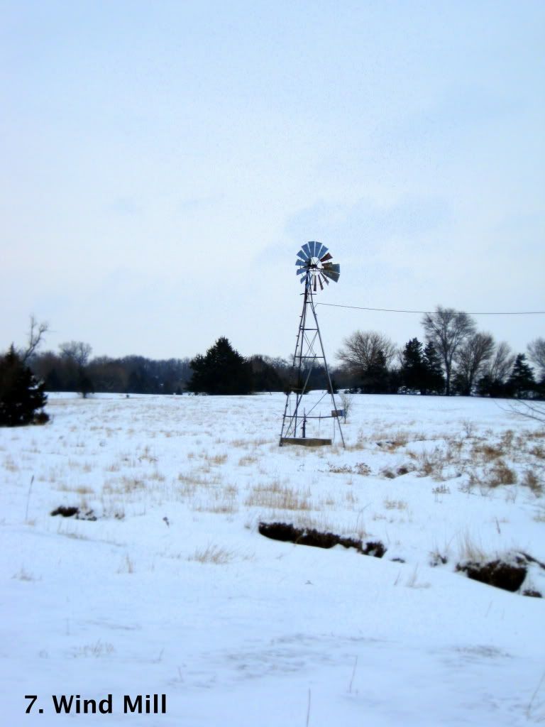
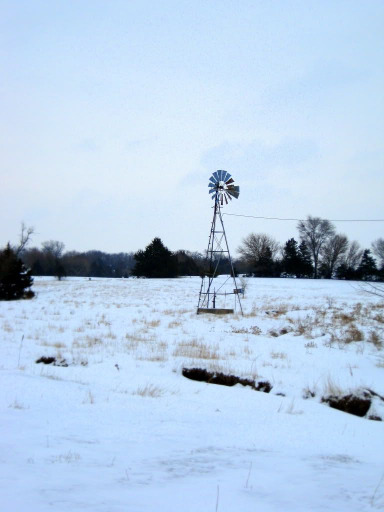
When actually taking the photos, one of the hardest things to grapple with was the lighting. I have learned the February in Nebraska can be a very unforgiving time of year to take photos. Many of the days I set aside to go take pictures ended up being snowy and gray–neither of which lends its self very well to the type of images I was taking. Photo 4 was one of the hardest images to capture because of the light nature of the wind turbine. In the first set of photographs for this image, there was very little contrast between the turbine and the sky. I wanted to focus on this contrast in my images, so I was taken back to this area to recapture this photo. The second time I went out, the sky was clear and deep blue creating a wonderful backdrop for the white turbine. For Photos 7, 8, 9, and 10, I also had to deal with the natural lighting. This was also a gray and cloudy day. Thankfully through the editing of these photos I was able to get rid of some of this unattractive lighting. In increasing the saturation and exposure of each of these photos, I was able to increase the contrast between the man-made and the environment.
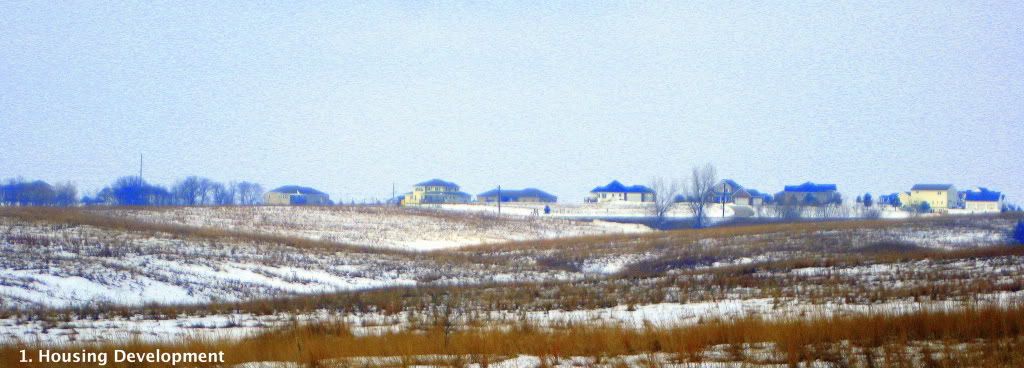
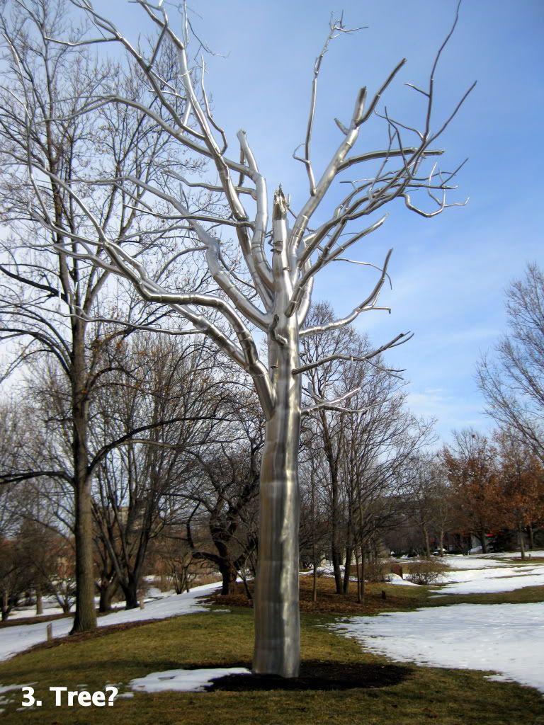
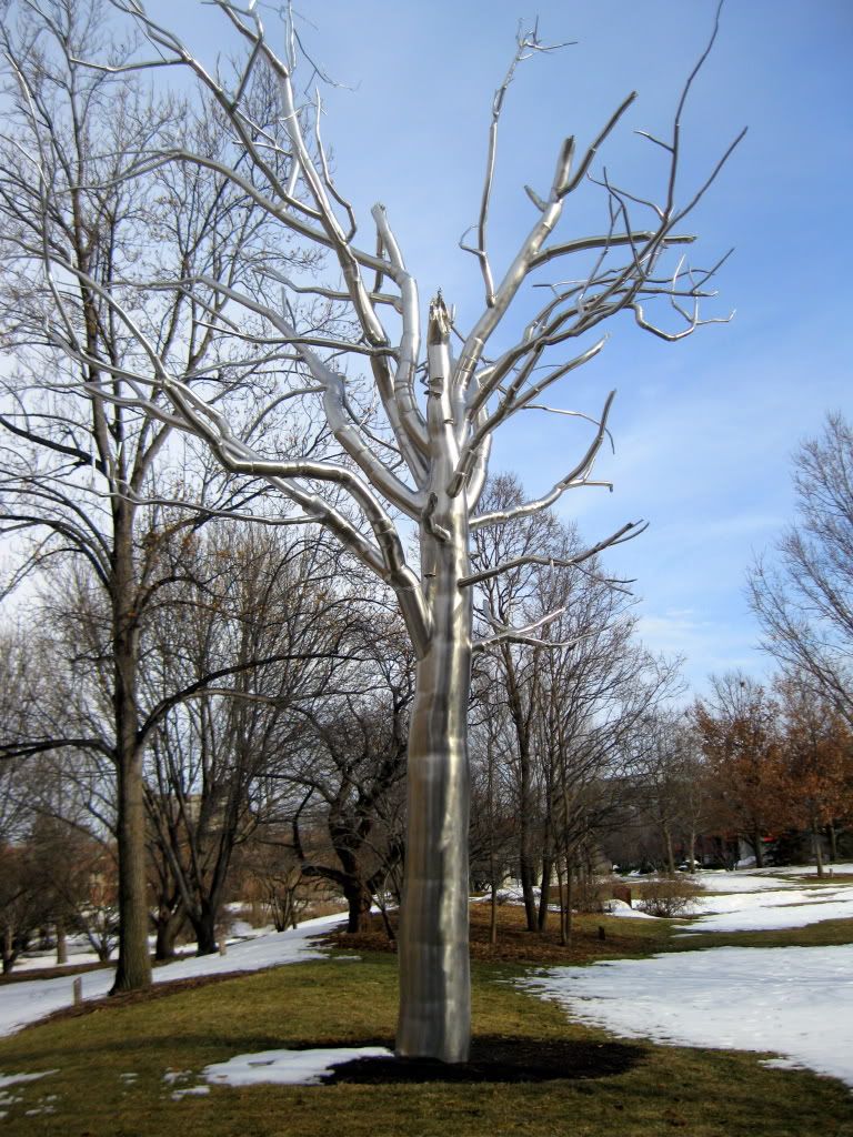
Also when revising my photographs from draft one to draft two, I had to revise the placement of them within the essay as well as the captions to become more relevant and informative. I rearranged the photos to be larger and at the beginning of the project so that my audience would have each of the images in mind upon their discussion in the artist’s statement. The revision of the captions is what proved to be harder than expected. These captions were meant to serve a variety of purposes for my audience. They are meant to guide them to the object I wished to be focused on but also to the context for the photo. For example, in Photo 3 in the peer revision, there was a lot of confusion about how this image was relevant to my argument and how it fit in with the rest of the images. Once I included the caption “Breach upon University of Nebraska Lincoln Campus,” it was much easier for my audience to see the function that this image had in relationship to my argument of the human interaction with nature.
There were also many revisions that went into the drafts of my artist’s statement. For the first draft, much of my statement included background information on the idea behind the project, such as the first sentence “One of my favorite places to be is outdoors, whether is in January scooping snow off the driveway or lying on the hot sandy beach at the lake on a hundred degree day in July.” This sentence really functioned in providing a context for my argument, but in the words of my peer reviewer “the focus of the essay should be on the rhetorical and aesthetic decisions related to your photos.” In agreeing with my peer, I edited much of this background information completely out of the statement, even entirely cutting out the second paragraph as it did very little to further the explanation of the rhetorical techniques I used when creating my photos.
Another area, where there was a lot of revision between drafts was the organization of paragraphs and the overall structure of the essay. In Draft 1, I picked three different rhetorical/aesthetic techniques to touch on and I lacked a true thesis statement. After my peer reviewer pointed out how this organization lacked a good structure and sense of true argument, I completely reorganized the structure of my essay to include pathos, logos, and ethos and all the rhetorical techniques within each of these appeals. After this major restructuring of the essay, in Draft 2 I was again advised to look at the content of each paragraph and split some of them up according to content. In regards to paragraph four, as advised by my peer, “Breaking this paragraph into multiple paragraphs would be beneficial to logically organize your thoughts for the reader.” So, I took this advice and split paragraph four at the break between arrangement and visual hierarchy. This also happened in a variety of other paragraphs to help aid in the organization of my thoughts for my readers.
Many of the revisions in my statement were large, structural revisions. Of course, the centralized content was also carefully examined and edited so that it fit together into logically and purposeful statements in furthering my argument. I hope that each of my revisions has helped to create a project than the revision before.


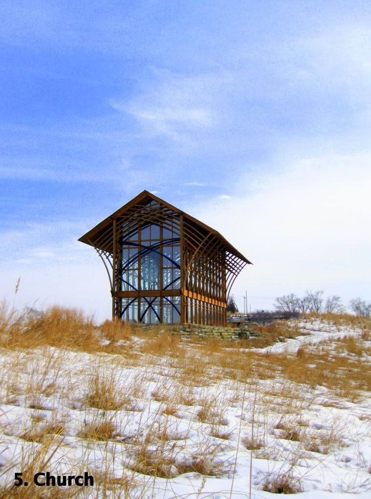
The countryside of southeastern Nebraska may seem monotonous to some, but this simplicity is what makes this landscape beautiful. On a clear February afternoon, when the sky is bluer than the ink of a ballpoint pen and the snow-crusted fields seem endless, the beauty is released from the eye beholder for everyone to see. But, the horizon is not uninterrupted, there is something in the way– something not made by Mother Nature, but by humans. This relationship between man and the environment is what inspired me to capture this series of photographs through the lens of my camera. With these images, I hope to create a dialogue with my audience that will inspire them to look closer at not only the interaction of humans with nature in general, but their own interaction with the world. When capturing these photos, I used a variety of rhetorical and aesthetic techniques to appeal to the pathos, logos, and ethos of my audience through the use of coloration, framing and cropping. After looking at my photos, I hope that my audience will feel the dissonance between the mad-made and the natural worlds in a way that will cause them to think more about how they interact with their environment, for better or for worse.
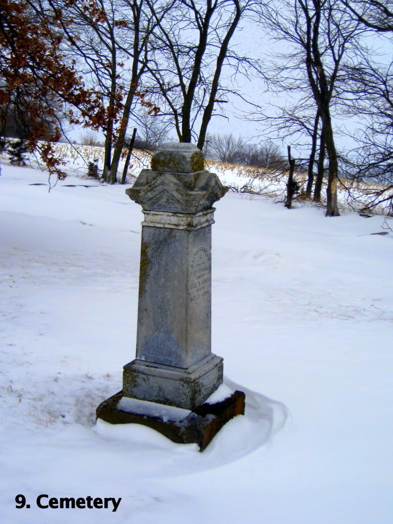
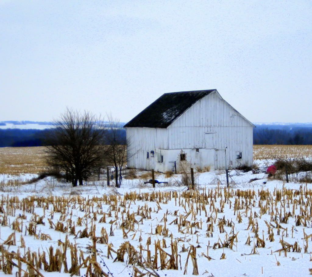
Coloration was a main focus within my photos when thinking about how I wanted to make my audience feel when looking at these images. When dealing with the natural sunlight, I had to use a variety of editing techniques to create the intended appeal to pathos for my audience. I wanted these photos to create a sense of brightness in terms of the sky to represent the open, natural expanse that is typically of a clear Nebraska day. One example of this clear Nebraska sky in one of my photographs is Photo 4. On the other hand, I also wanted to capture the hazy glow of a snowy February day to create a sense of gloom and dissonance for my audience. I tried to capture this “hazy glow” in Photo 8. When deciding on these aesthetic elements within my photos, I also wanted to pull my audience into them and evince a strong emotion from these people. When creating both of these looks to my photographs to appeal to the emotions of my audience, I utilized saturation to increase both the hazy and open-sky look. In the open sky photos, I also fixed the amount of exposure, creating a more saturated and brighter look to all elements of the photos, allowing not only the bright sky to shine, but the man-made objects as well.
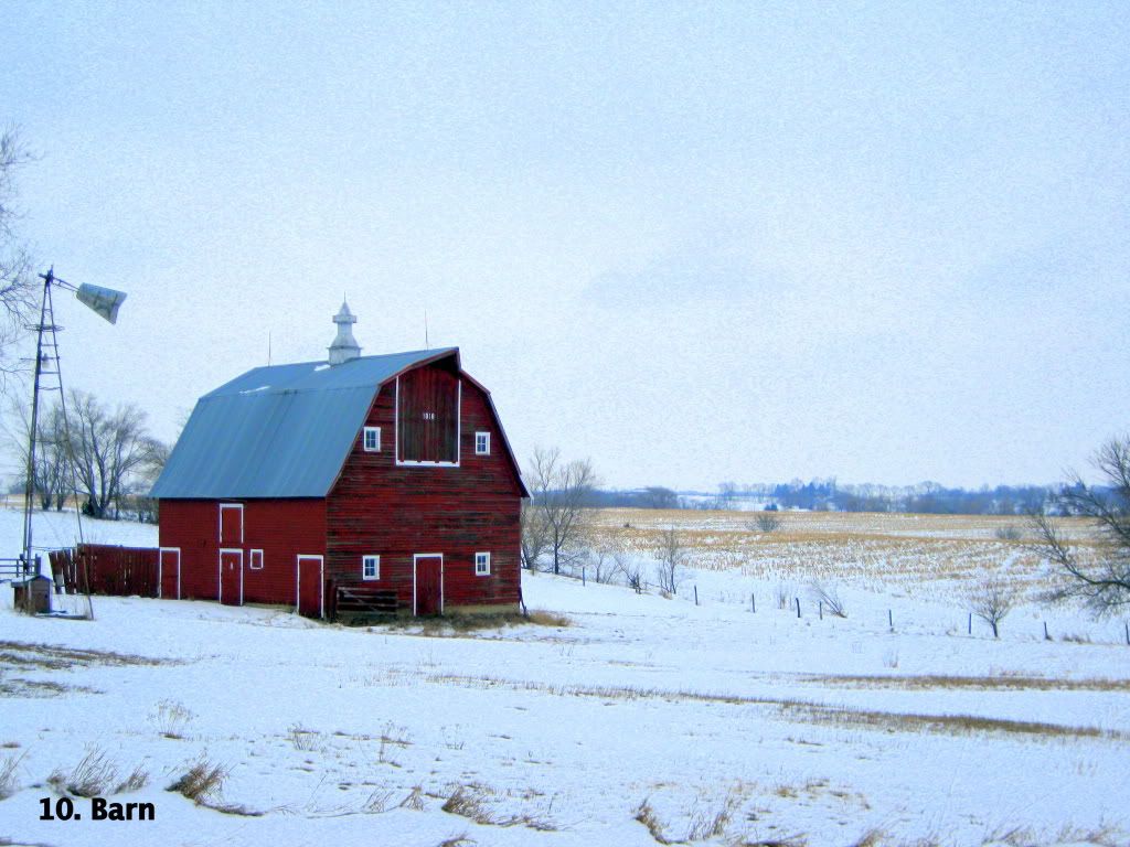
In addition to saturation, I utilized hue in creating a contrast between the natural and the man-made. I wanted to create a feeling of discord between these parts of the photos to specifically appeal to the emotions of my audience. I tried to look for hues far apart from one another on the color wheel to amplify this contrast. One of the best examples of this contrast according to hue is Photo 10. I also employed hue as a tying element throughout the essay– each photo is composed of a blue sky, tan ground, and the object being focused on. As well as increasing saturation to capture the specific lighting in each photo, I utilized saturation in relationship to hue. I wanted these photos to be highly saturated to amplify the hues and give these photos a strong and eye-catching presence individually, as well as together as a visual essay. I also wanted this high amount of saturation to create a strong emotion in the audience when looking at the photos, whatever that feeling may be. Creating a sense of unity throughout the photo essay was important when taking and editing these photos that I employed not only through coloration, but through the arrangement of each of the elements in the images as well.
To appeal to the logos of my audience, I “limit[ed] [my]self to three to four elements” in each picture (Wysocki, Lynch 286). This use of only three elements allowed me to keep my purpose and the relationships I was trying to portray straightforward as well as staying consistent with the simplicity of the environment I was capturing. I also used this small number of elements, again, as a theme throughout the essay. I wanted to make sure that each photograph looked like part of a collection, but could also function on its own. When creating a prominent theme within the essay, I was able to allow my audience to see how each photo fit into the overall argument. This unity among the series of the photos was also created through the arrangement of each of the objects within the image. The man-made structure was the prominent part of the photo and when I was capturing the images, I made sure that there was consistency in the placement of this subject in perspective with the sky and the horizon. The arrangement of the photos as an essay also was an important part of appealing to the logos of my audience. I arranged them in such a way that they progressed from the newest to the oldest interaction with nature as well as by location. This progression from new to old allows the audience to compare how the interaction with nature has changed over time. Logically, it made sense to arrange them by location so that the landscapes fit together to create a sense of the larger environment for the audience, in a way similar to how puzzle pieces fit together to create the whole picture.
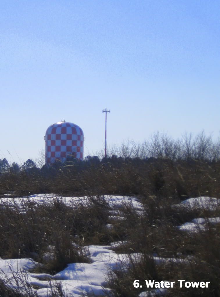
Visual hierarchy was also important in the arrangement aspect of the design process within the photographs. I used visual hierarchy as a tool to direct my audience’s eyes through the aspects of the photos as they were viewing them. I made sure the item I wanted to be the focus of the photo was in the “top left or top middle. Because we have learned to read from top to bottom and left to right…” (Wysocki, Lynch 287) One example from the collection of this arrangement is Photo 6. I used the horizon as a backbone for the arrangement, anchoring and dividing the image, and tried to create a visual path along this horizon for viewing ease. Creating a repetition throughout the photo essay was important when capturing each image, but I also wanted to make sure that each image was able to have meaning as a single photo.
When making sure that each image worked on its own to appeal to the logos of my audience, I focused on the framing of the photo as it was being taken and the cropping of the images once they were downloaded to my computer. Framing is important when considering the logos of my argument because it can again, create a consistency between each of the images and create a logical focus to the subject of the photo. When framing the photos, I wanted to make sure that I got a variety of shots from a variety of angles, so that I could later decide what part I wanted to most focus on in the shot. I also had to think about how I wanted my audience to be oriented in relationship to the subject of the photo. Sometimes this required me to put myself in shoes of my audience and think about how to orient myself to give them to best context for each image. This was especially important for Photo 3, because of the buildings in the background. I wanted to make sure that these buildings were not easily visible within the photo, because I all of the other photos contain the two simple elements; the subject and the environment without any other buildings or distractions. Cropping was also important when thinking about my audience and the sense of logical consistency with the number of objects within each photo. I wanted to make sure that there was a sense of intimacy and closeness to subject, but to also create an even balance of distance as well. When making sure the limited number of objects within the photo portrayed a sense of simplicity, cropping was an important aesthetic decision as well.
As, a photographer with a specific argument I wanted to portray, creating a sense of ethos within my photos was of great importance as well as pathos and logos. As stated above, I used a small number of elements within each of my photos to keep consistent with the environment I was photographing, but I also limited the number of parts to my images to allow the photos to be easy to look at and have the attention be drawn to the main subject immediately. I did not want to make my audience search for the focus of the photo because “visual communication…[has] t[aken] on the values of quickness and directness”. (Wysocki, Lynch 270) The position that the photos were taken from also was taken into consideration in appealing to my audience. I wanted the perspective to remain consistent and allow each subject to be immediately recognizable. Both of these appeals work to, again, remain consistent to the efficiency that our society has adopted. The subjects of the photos, also specifically work to appeal to my audience and their trust in my decisions as the photographer. I chose places that are culturally relevant to the location in which we live. These subjects are common and everyday, but displayed in a way that looks at them from another point of view.
In conclusion, there were many rhetorical and aesthetic techniques that went into the shooting and editing of each of the photographs in my photo essay. I used these rhetorical devices to appeal to pathos, logos, and ethos through coloration, arrangement, and framing that created a unity throughout my entire visual essay. Many aesthetic decisions were also made in the composition of these photos. I hope that each of these images emits an emotion from my audience that will strike a sense of curiosity. These images are centralized to one small part of the landscape of our world, but the human interaction within the world around us is evident everywhere. I hope that my audience can gain a view of the relationship that humans have with their environment in the terms of their own landscape and that that these photos will prompt them to think about how the decisions they make may later have repercussions that will be difficult to undo.